TRY1
A fashion-tech brand connecting online discovery with physical fitting spaces. Born in Milan. Built to grow across cities.
CREATIVE DIRECTOR & BRAND DESIGNER — ANNA DMITRIEVA
MILANO, ITALY · 2026
From a blank page
to a living brand.
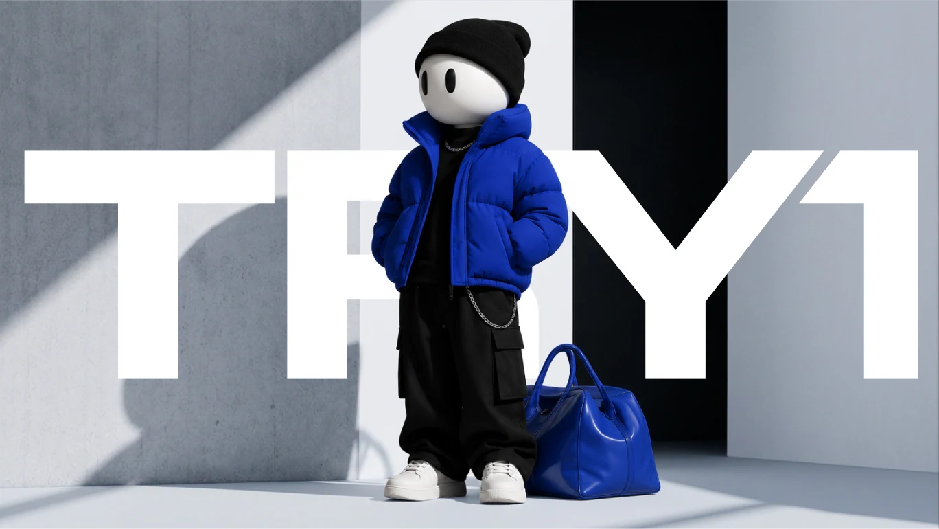
As creative director, I led TRY1 end to end: the positioning and creative platform, the identity system, the character and image world, and how the brand comes to life across digital, retail, packaging and the city.
01
Strategy
- Positioning and audiences
- Creative platform
- Brand architecture
02
Identity
- Wordmark and digital signature
- Colour and typography
- Location ID system
03
Character & image
- Mannequin-inspired character
- Art direction of the image world
- AI-generated brand films
04
Rollout
- Digital touchpoints
- Fitting points and retail
- Packaging and urban activations
The new layer
of fashion.
TRY1 lives in the gap between discovering fashion online and trying it on in real life. The identity had to connect both worlds: bold in fashion, precise in infrastructure, human at every touchpoint.
OnlineTRY1Physical
Bold
A confident fashion presence.
Flexible
Open to any partner brand.
Precise
IDs, data and structure.
Human
A face people recognise.
Built to connect.
A compact wordmark with custom cuts and connected forms, plus an icon derived from its geometry for app, avatar and small-format use.



A signal.
Not a shout.
A neutral foundation lets TRY1 sit inside any fashion brand. Blue is the signal and never takes more than a quarter of a composition. Inter Display speaks fashion, PT Mono speaks data.
#FFFFFF
RGB 255 255 255
#F0E7DC
RGB 240 231 220
#D3D4D9
RGB 211 212 217
#000000
RGB 0 0 0
#034DC3
RGB 3 77 195
#DACA99
RGB 218 202 153
NEUTRALS > 75% OF ANY COMPOSITION · ONE ACCENT < 25% · BLUE AND YELLOW NEVER COMPETE IN ONE IMAGE
Inter Display — primary
ABCDEFGHIJKLMNOPQRSTUVWXYZ
abcdefghijklmnopqrstuvwxyz 0123456789
Headlines, key messages, large-scale typography.
PT Mono — secondary
IT-MI / 00127
45.4642° N / 9.1900° E · STATUS / ACTIVE
Technical data, coordinates, unit IDs, labels.
One point.
One ID.
Every fitting point gets its own code, coordinates and status. The technical layer turns each location into part of one network that can grow city by city.
IT-MI
00127
IT — country code
MI — city code
00127 — unit number
- Type
- FITTING POINT
- Coordinates
- 45.4642° N / 9.1900° E
- Partner
- PARTNER / NAME
- Status
- ACTIVE
- City
- MILANO / IT
IT-RM / 0001
Rome
STATUS / ACTIVEIT-MI / 0002
Milano
STATUS / ACTIVEFR-PA / 0003
Paris
STATUS / COMINGDE-BE / 0004
Berlin
STATUS / COMINGBUILT TO SCALE — EACH NEW CITY AND LOCATION RECEIVES ITS OWN CODE IN THE SAME SYSTEM
A familiar face.
An open identity.
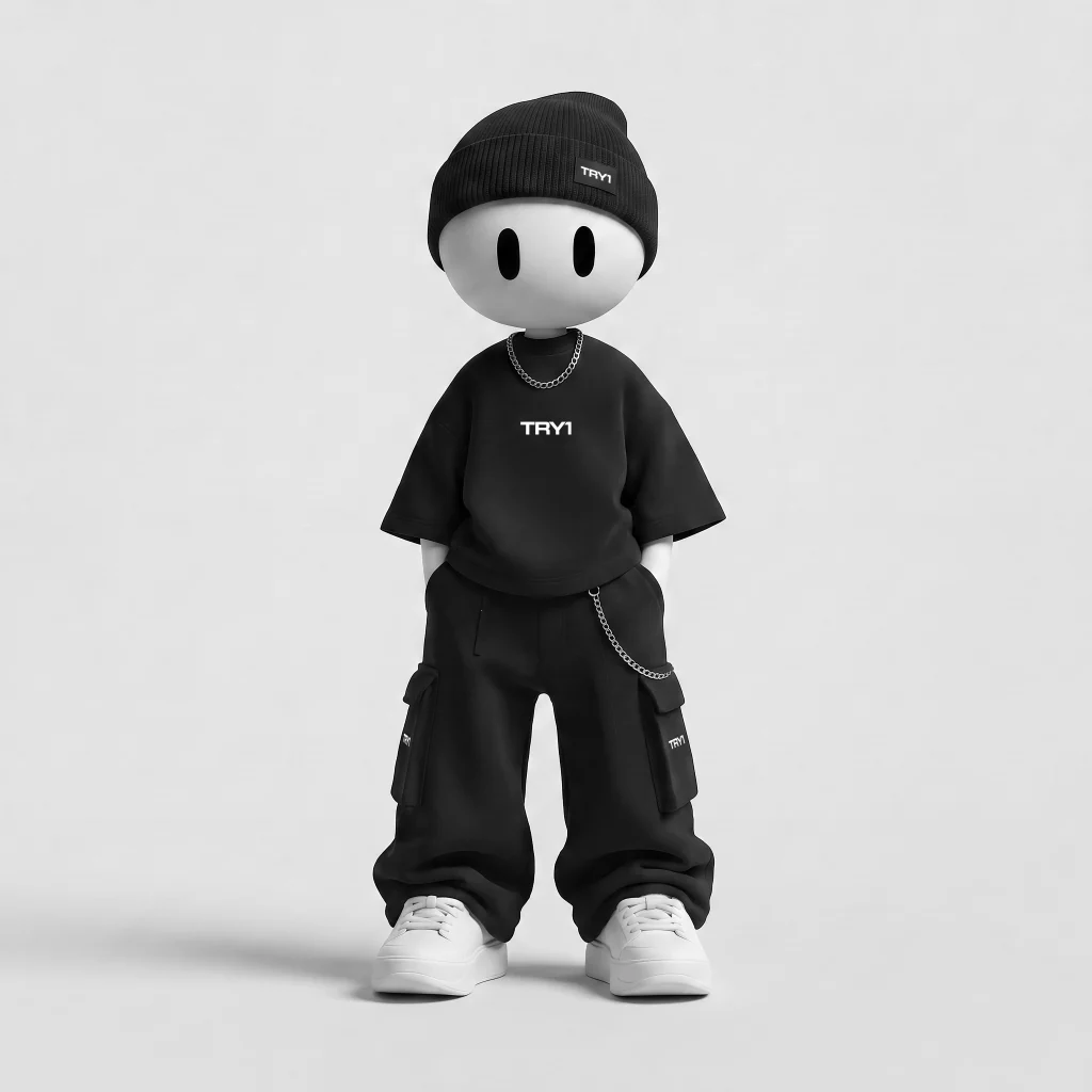
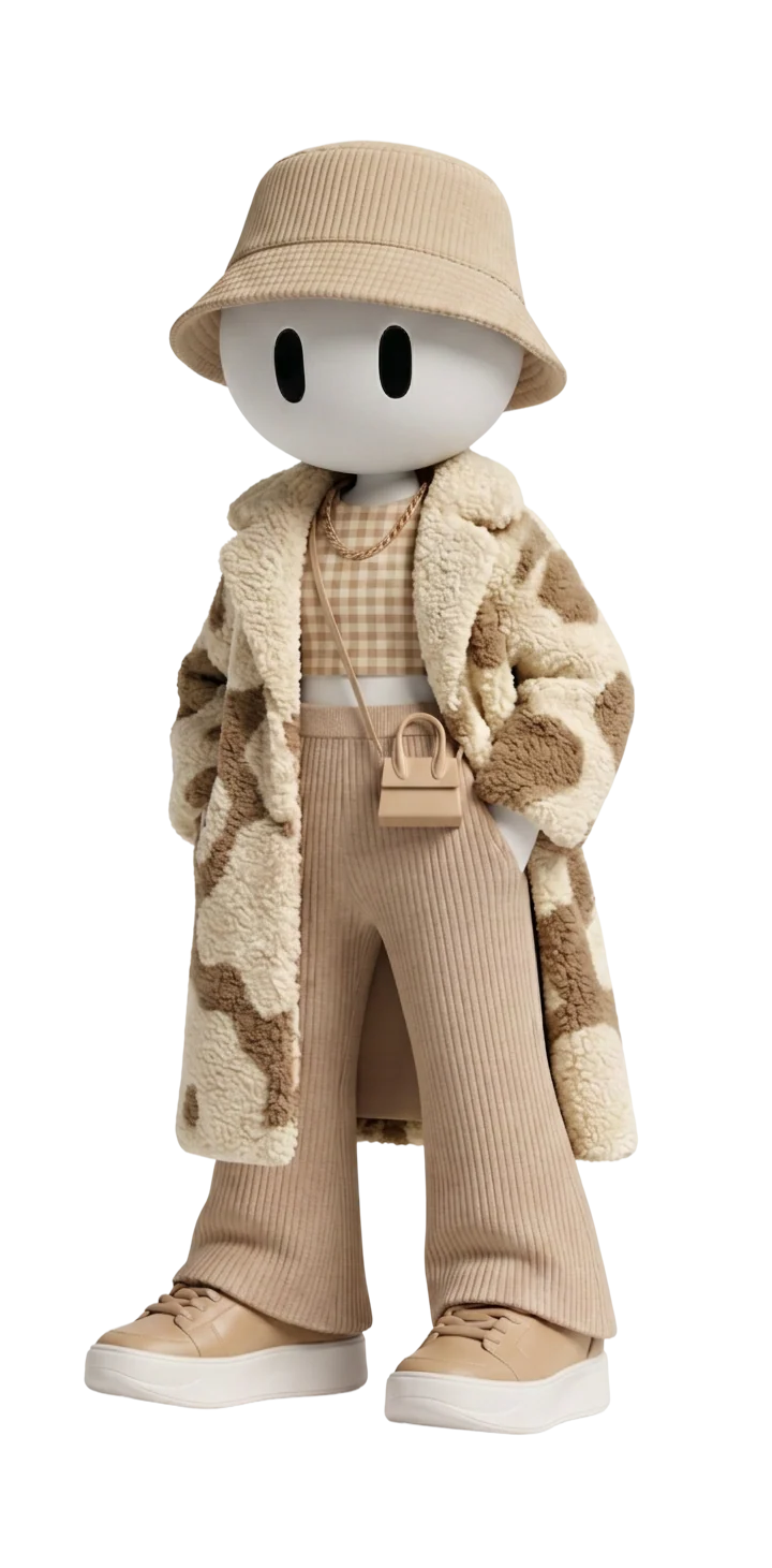
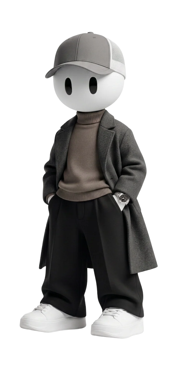
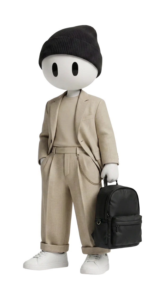
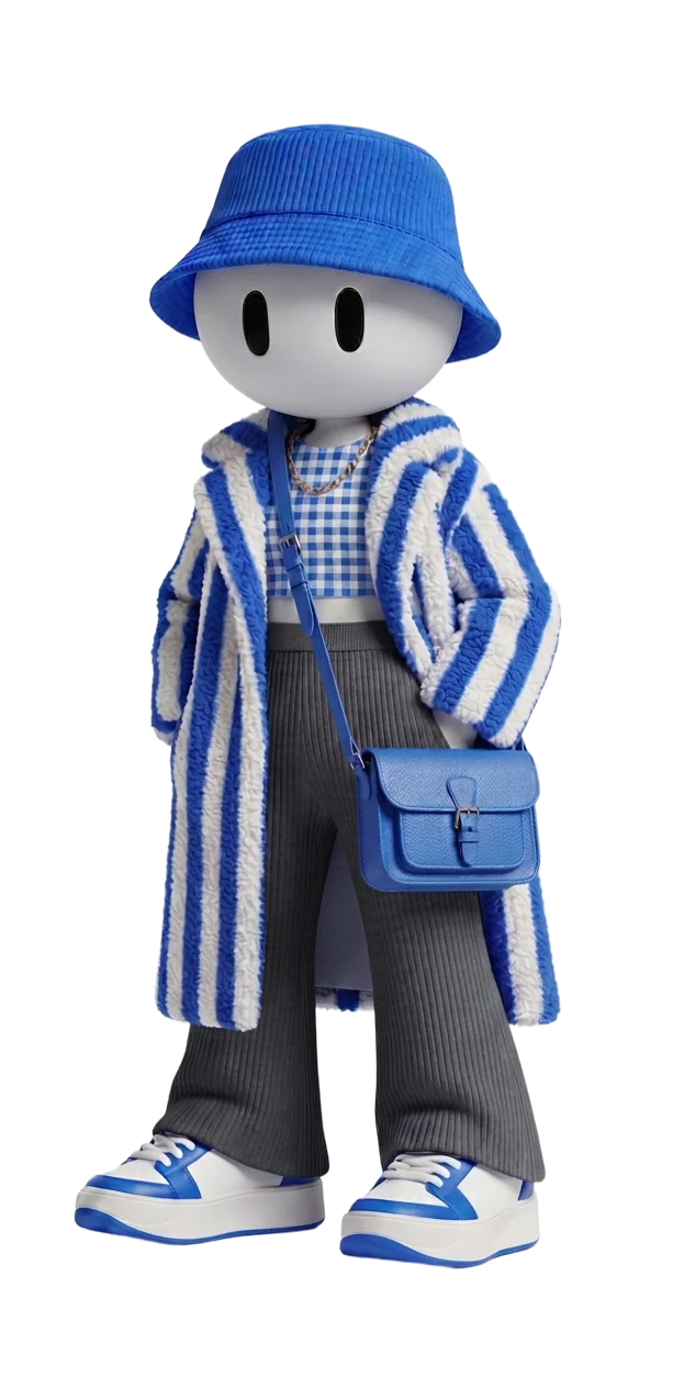
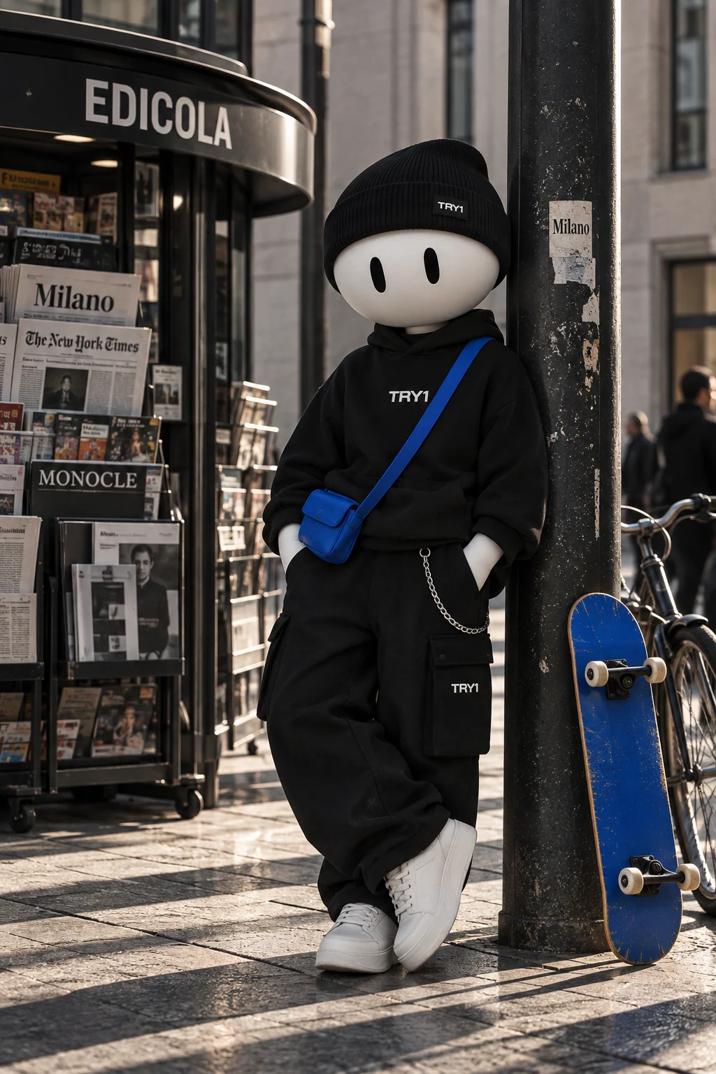
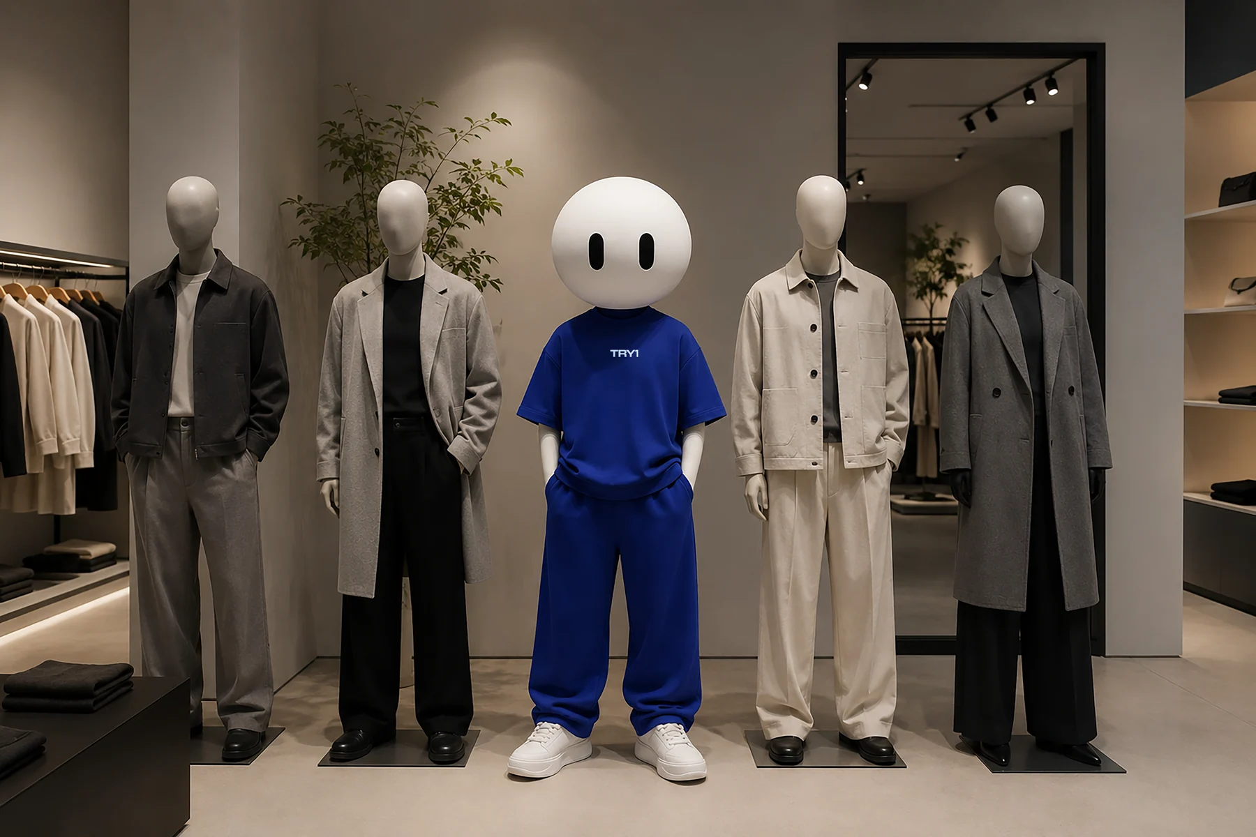
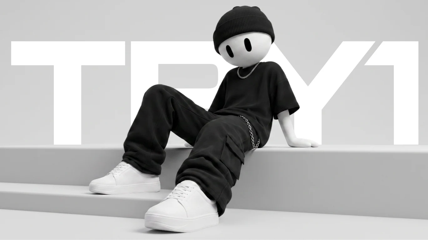
The mascot is inspired by a mannequin, a familiar object from the fashion world. No gender, age or cultural codes: the white head and two vertical eyes never change, the clothes always do.
What never
- changes
- Icon head
- Always the same
- Minimal eyes
- Two verticals
- Minimal face
- Eyes only, no fixed expression
- Universal
- No gender, age or culture
- Effortless
Four levels of presence
Each version has its own job. The bigger the format and the moment, the more of the character you see.
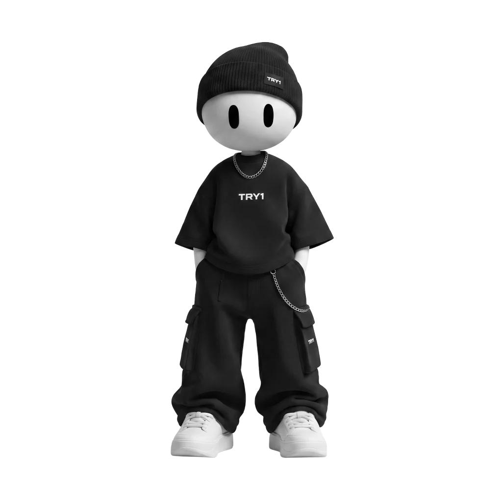
Full body
Campaigns, storytelling, social media and spatial activations.
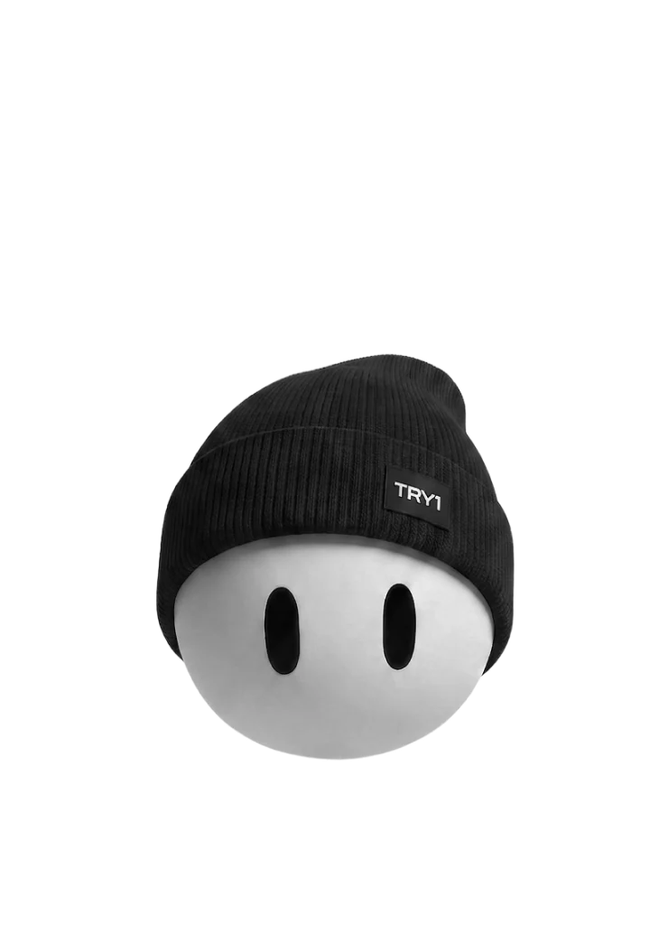
Head only
Retail environments, installations, window displays and bold brand moments.
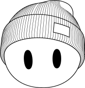
Illustration
Digital communication, app, functional content and small formats.
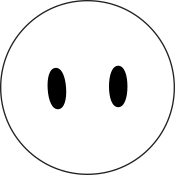
Eyes only
Subtle branding and details: tags, packaging, a minimal TRY1 signature.
The face stays. Fashion changes.
Streetwear, tailoring, sport or a partner collection: styling is the variable, the head is the constant.
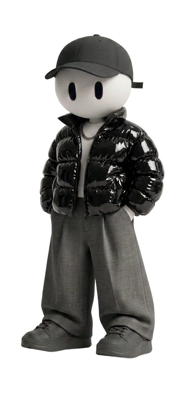
Constants
Mascot head · Typography · Technical data · Frame system
Variables
Fashion · Partner · Location · Accent colour · Campaign imagery
Fashion
happens here.
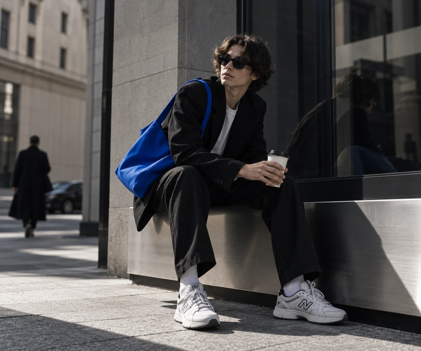
Rooted in fashion, never traditional fashion advertising. Clean editorial images, the real streets of Milan and one unexpected detail. I art-directed the image world and its rules.
Editorial & street
Contemporary, confident and slightly unconventional, simple enough for the graphic system to live around it.
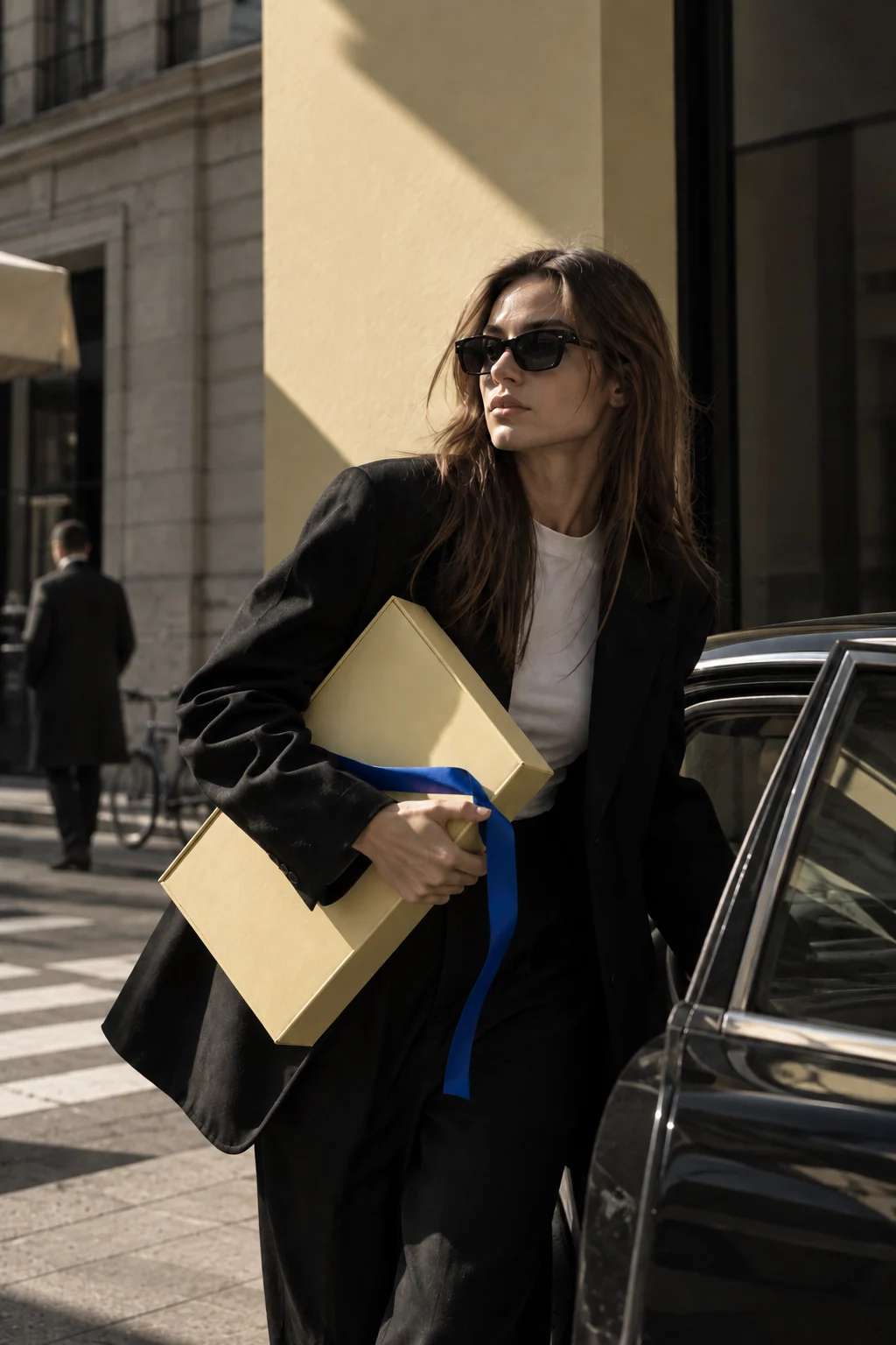
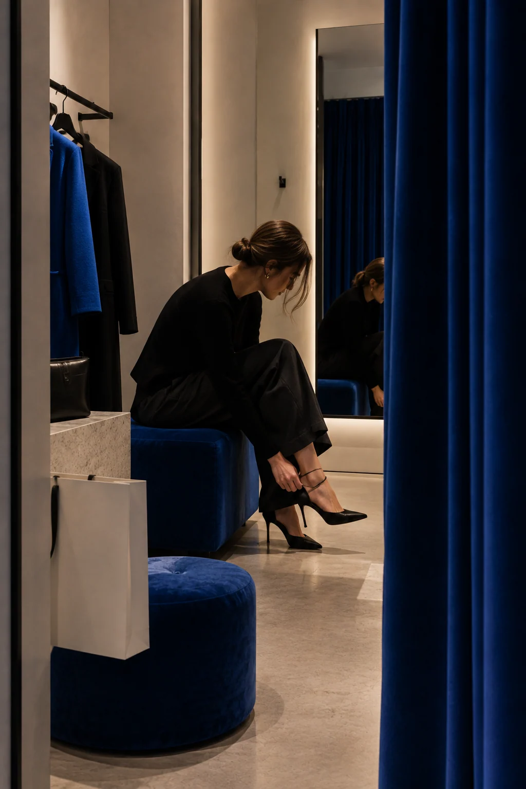
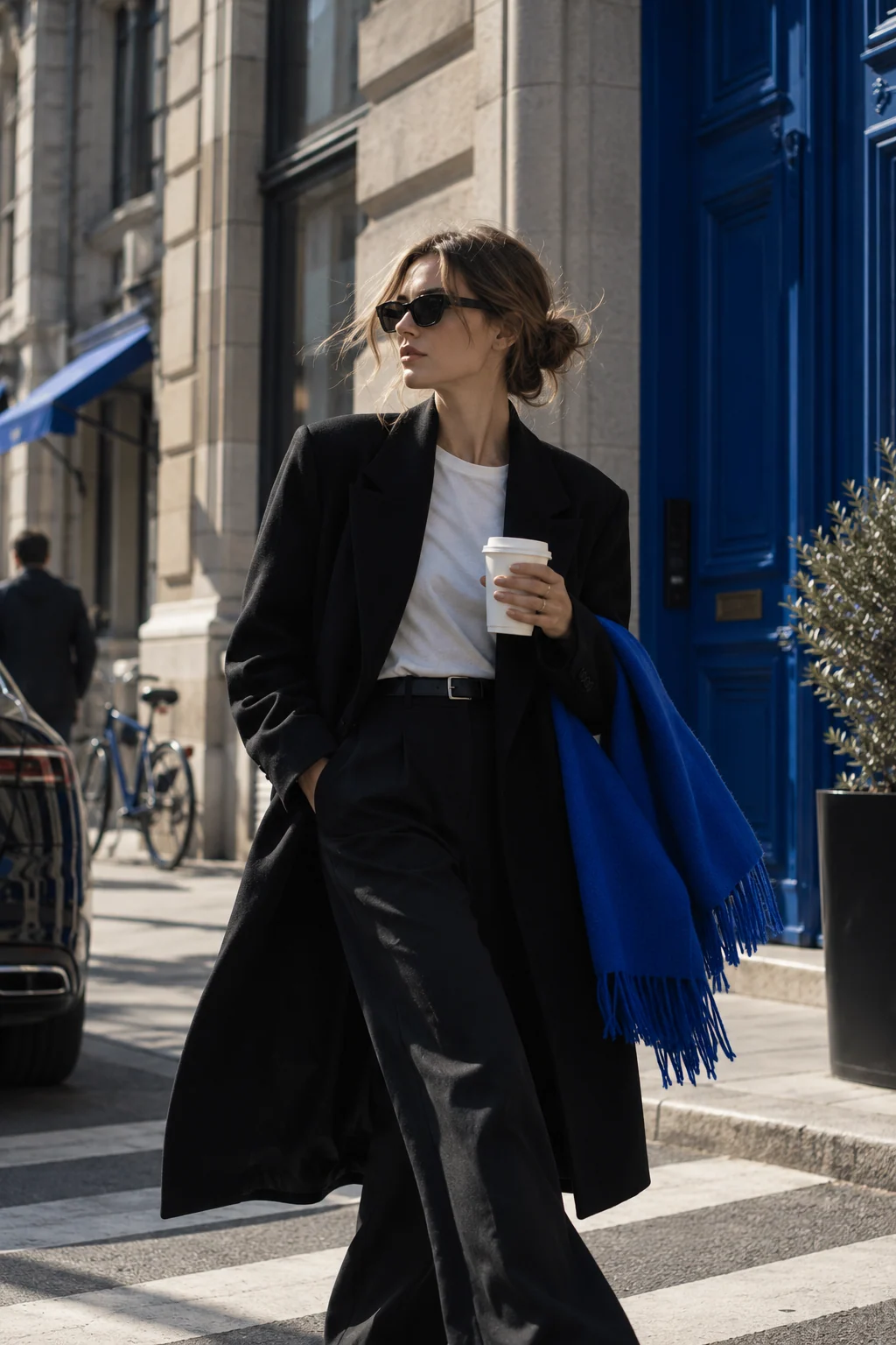
One image. One colour focus.
Neutral by default, colour by intention: blue or dust yellow appears through clothing, objects or light, never both at once.
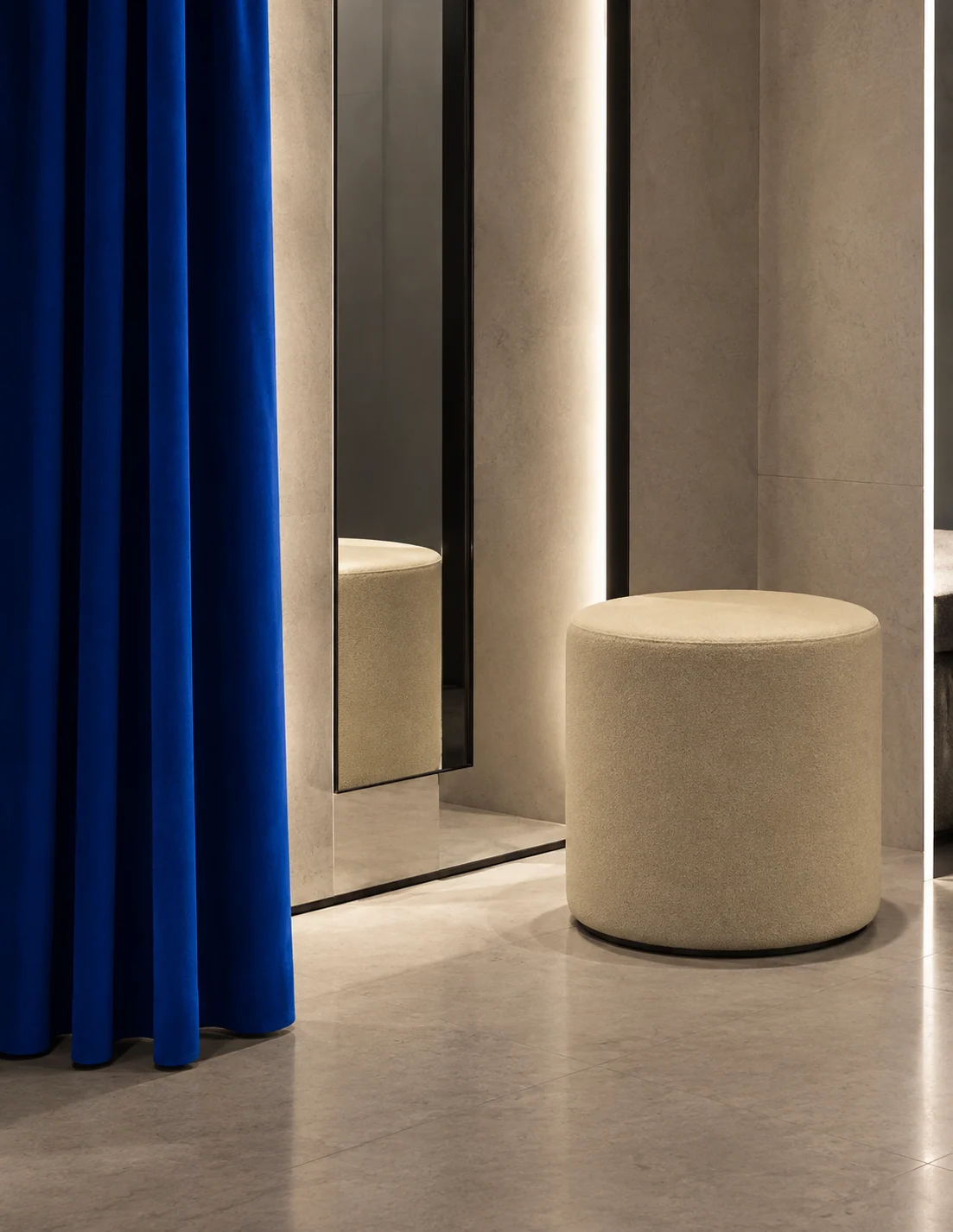
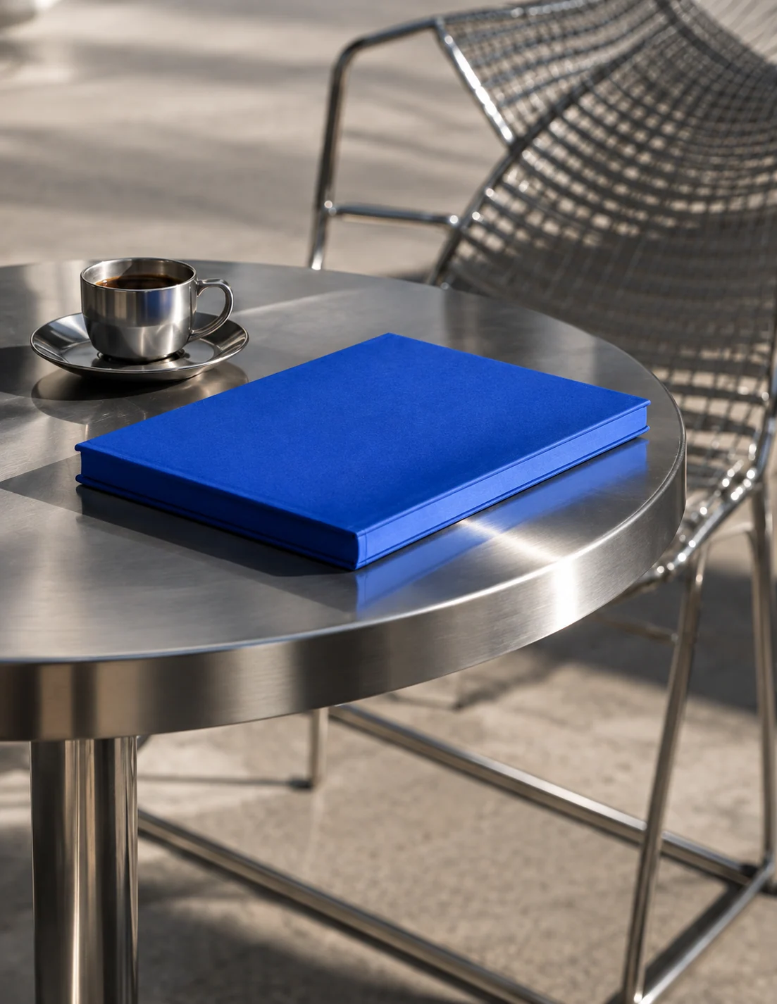
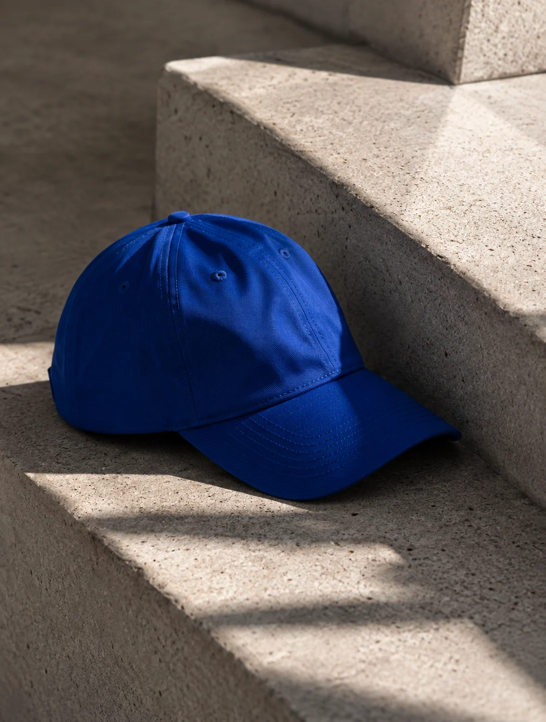
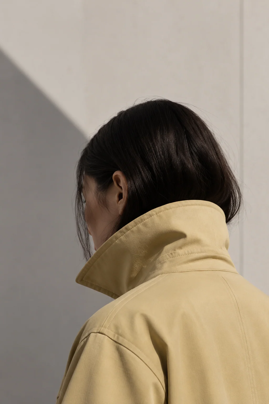
Clear focus. Room to breathe.
One subject per image. Negative space leaves room for typography, data and the frame.
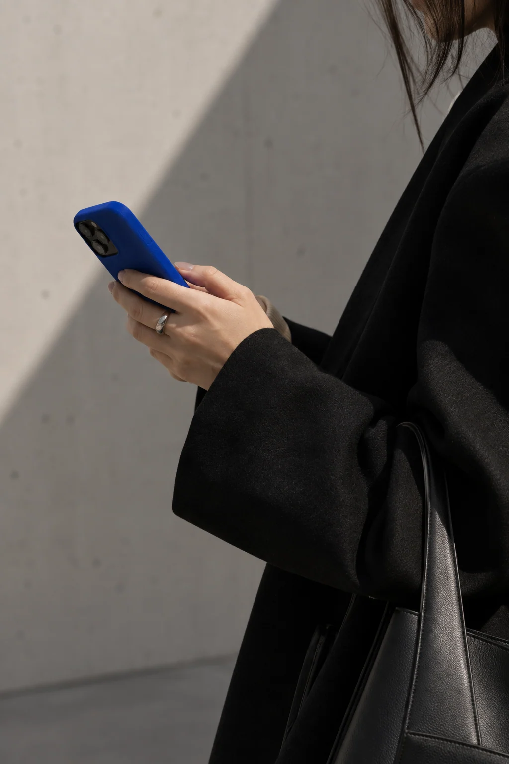
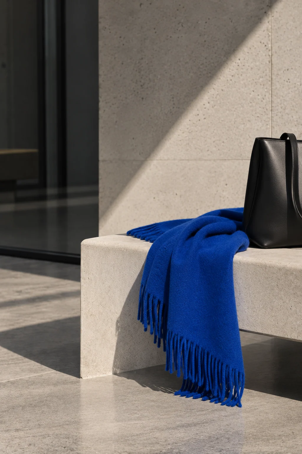
Four image types
A clear brief for every shoot and every AI-generated scene.
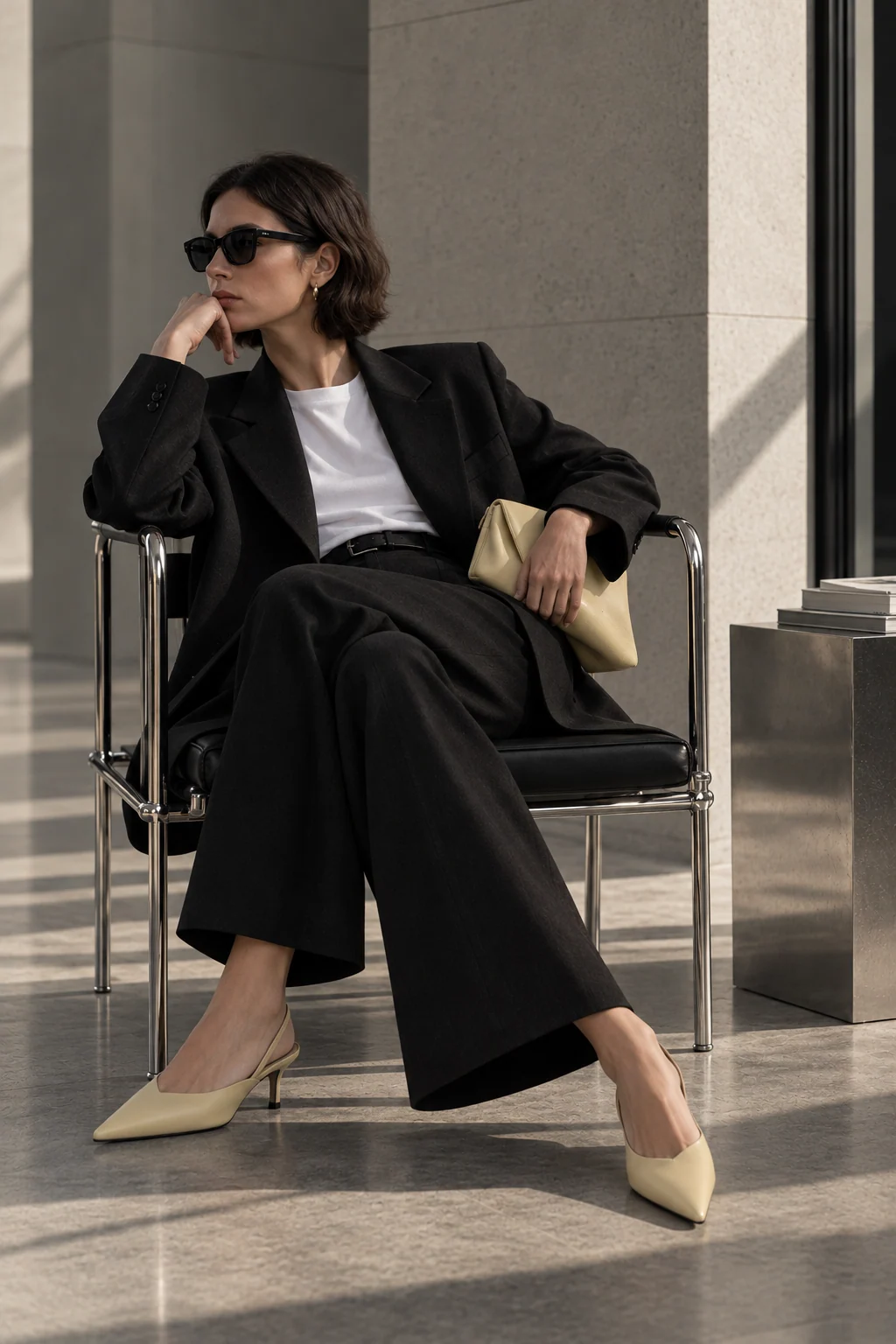
Editorial
Fashion-led, controlled, premium.
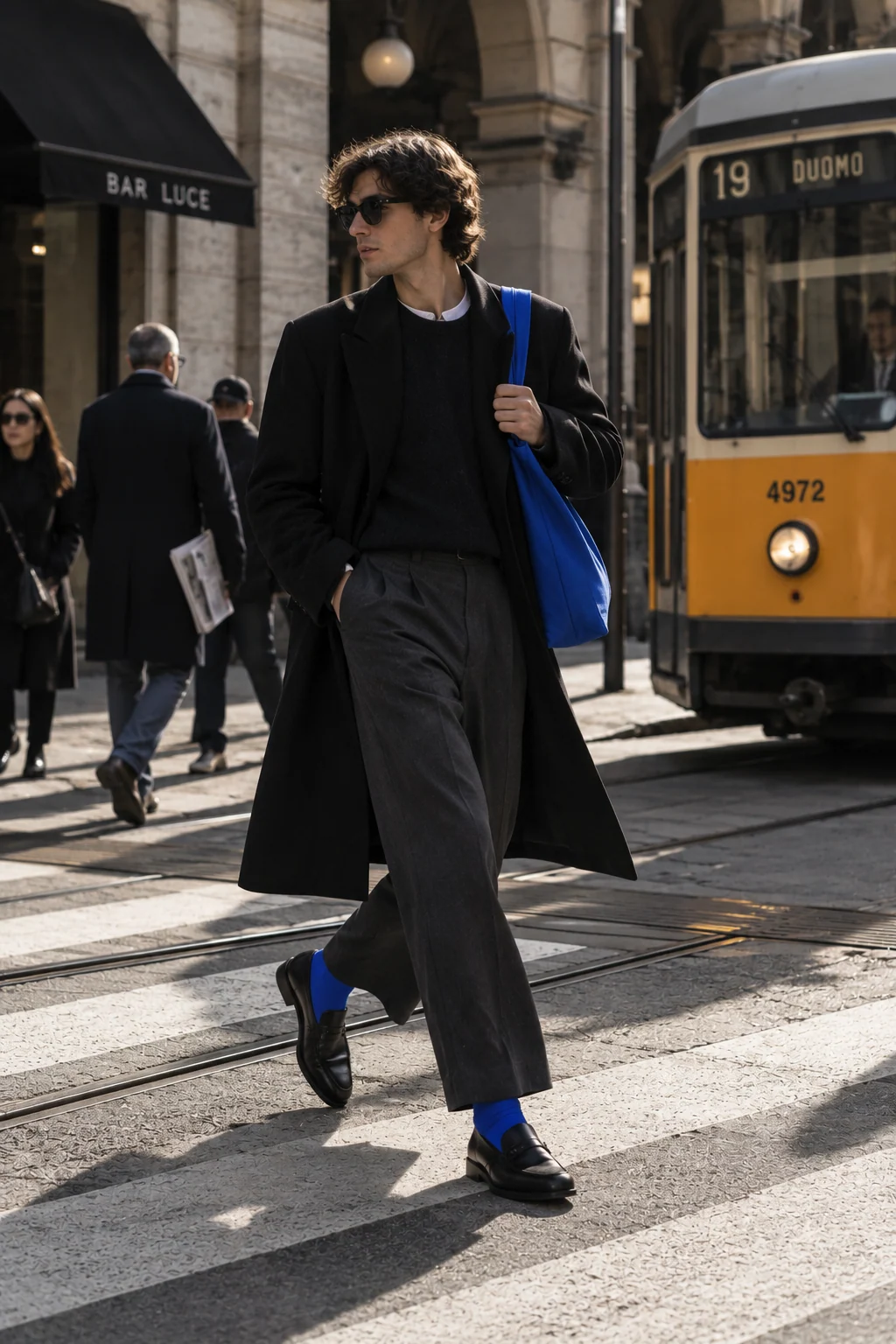
Street
Real city, natural situations, movement.
Product
Clothing, bags, tags, lockers, details.
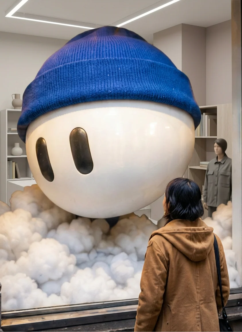
Unexpected
Oversized mascot head, surreal but believable.
From first click
to the fitting room.
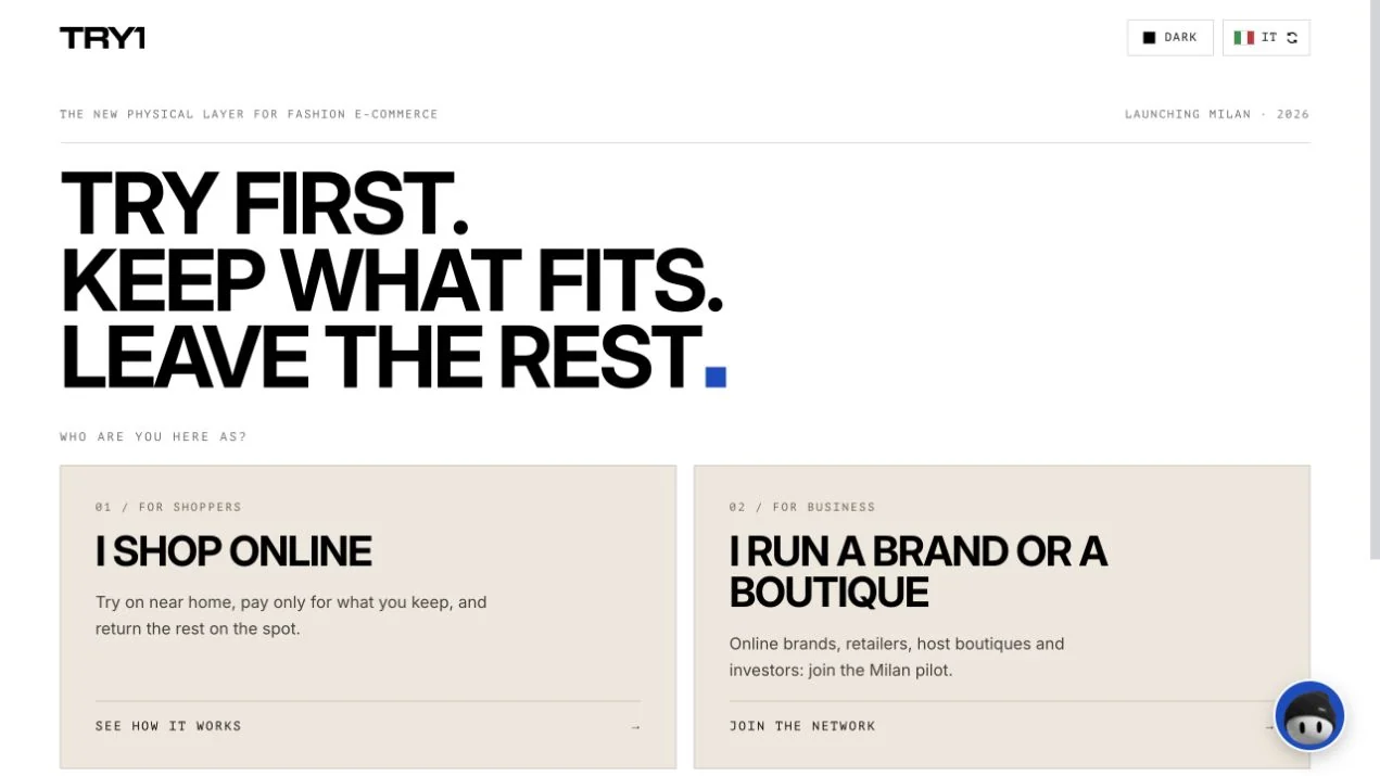
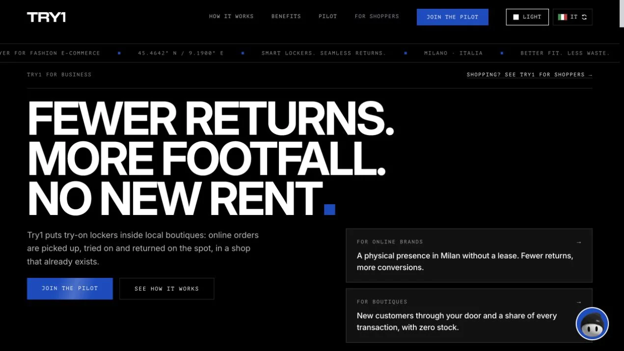
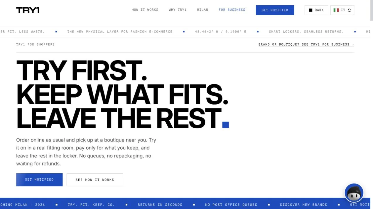
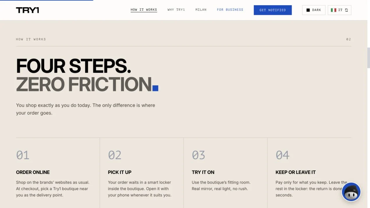
The identity carried into the digital product: one brand, two ways in, for shoppers and for partner boutiques. The website was designed and built by the TRY1 team on this system.

A place
to connect.
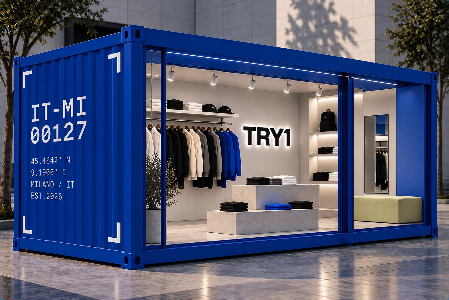
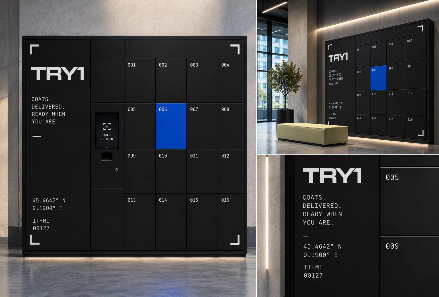
Fitting points and lockers turn a functional service into a recognisable place: bold type, unit IDs, technical data and the corner frame, adapted to each architecture.
Spatial identity
A fitting point in a container: unit ID and coordinates on the façade, the corner frame and a clean interior.
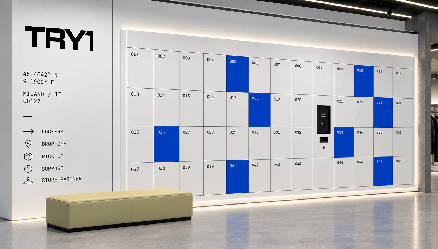
Locker system
Clean structure, selected blue doors, large-scale branding and the unit ID of each location.
Present, not dominant.
TRY1 joins the partner’s store without taking it over: a blue signal in the window and a recognisable fitting zone inside, while the partner brand stays dominant.
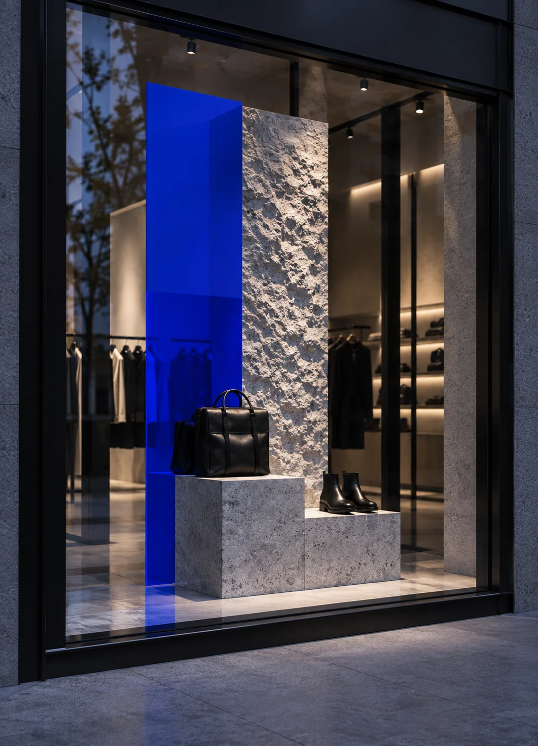
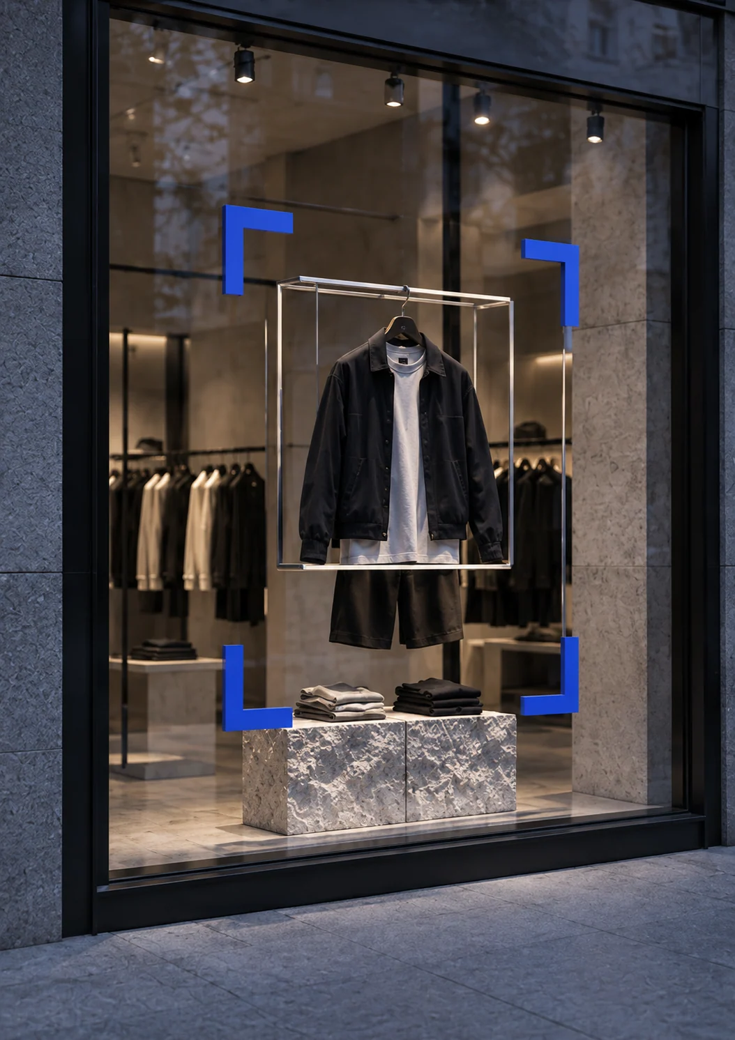
Storefronts
Blue accents and corner markers: TRY1 is available here.
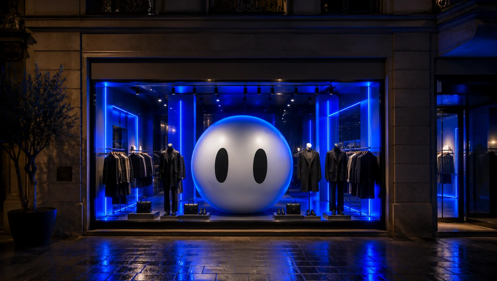
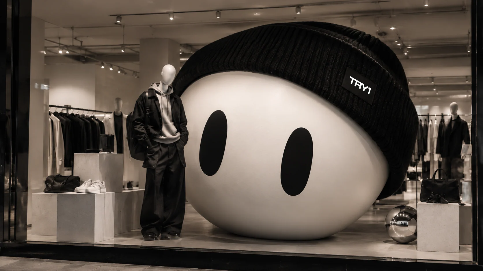
Window displays
The head-only mascot as a bold window moment.
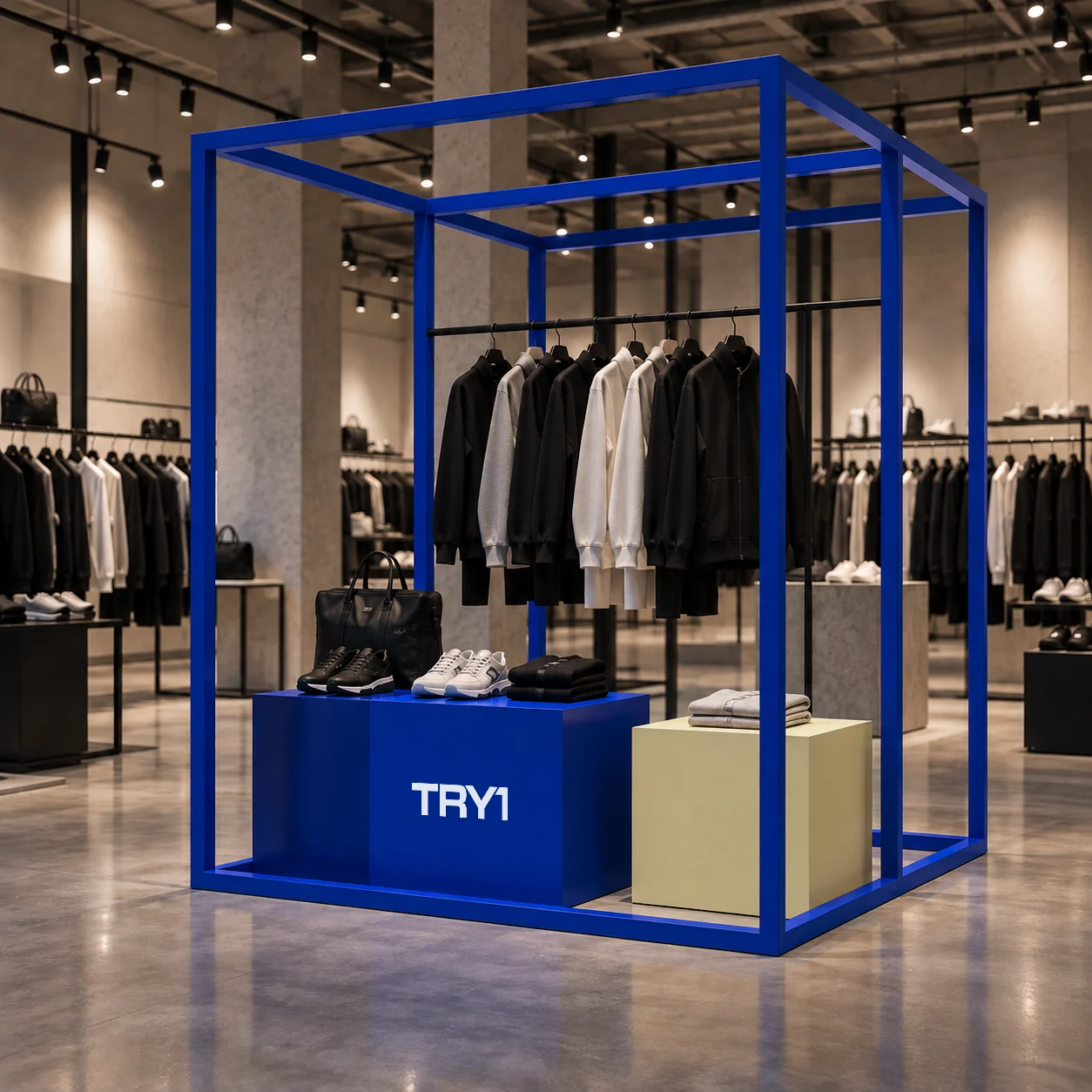
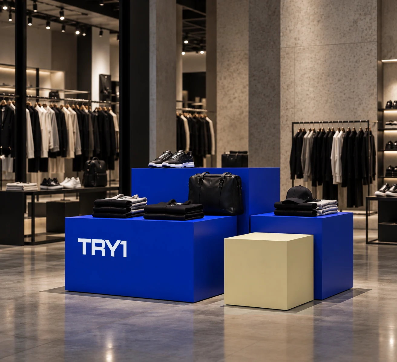
Inside partner stores
Modular structures, branded furniture and selected colour accents create a TRY1 zone.
Recognition outside.
Discovery inside.
Packaging is part of the experience, not just a container: clean and functional on the outside, colour, messaging and small surprises inside. Every layer carries the system, from logo and data to tone of voice.
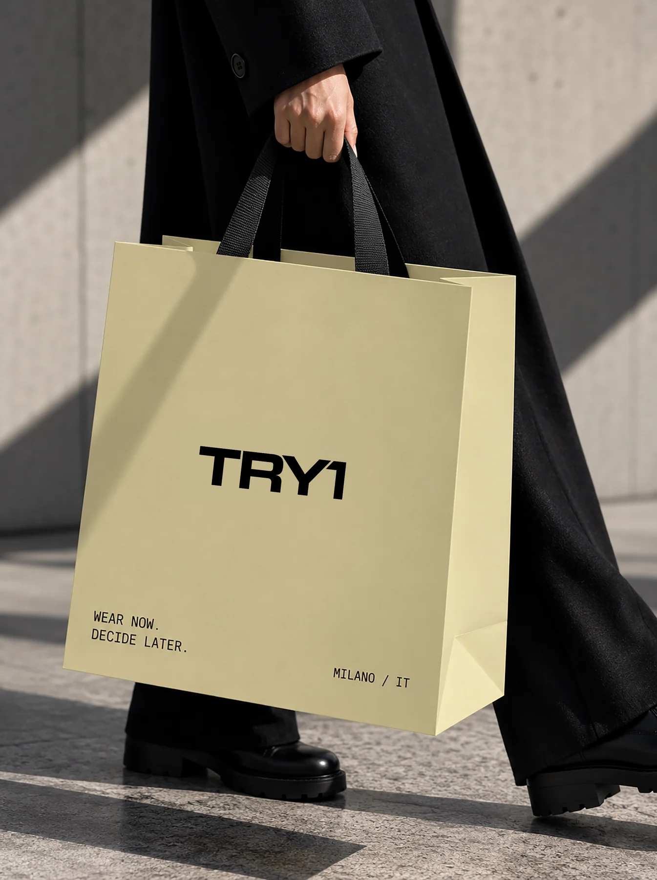
Paper bags
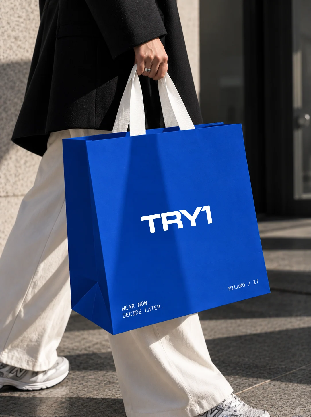
Try1 Blue, Dust Yellow or neutral: bold colour, minimal branding and technical details at pickup.
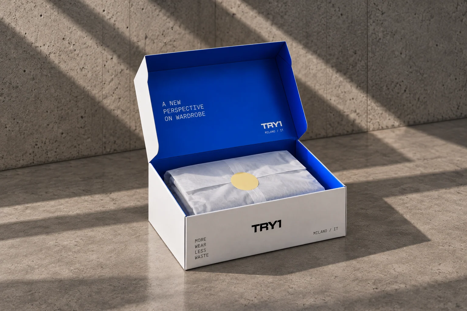
Boxes
A white exterior, a Try1 Blue interior with a message.
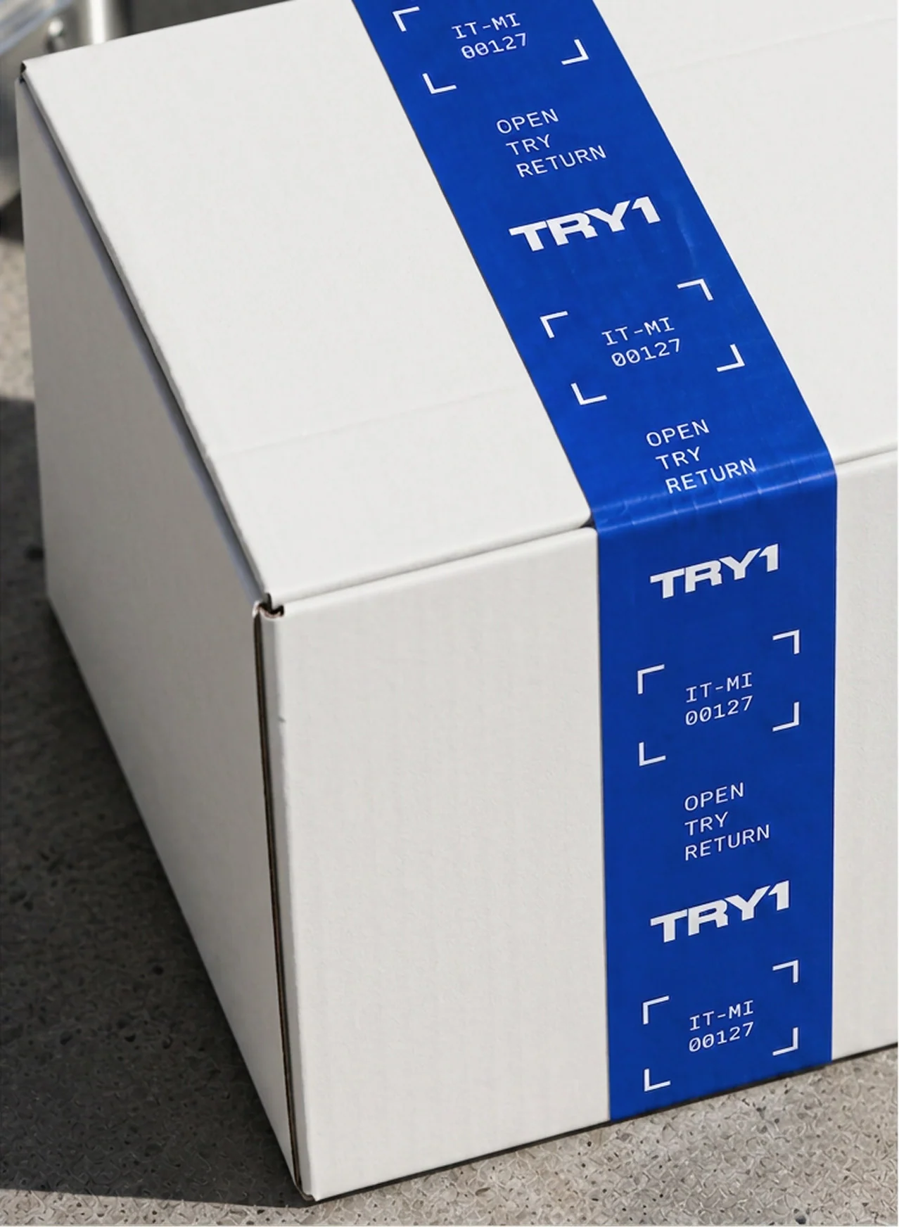
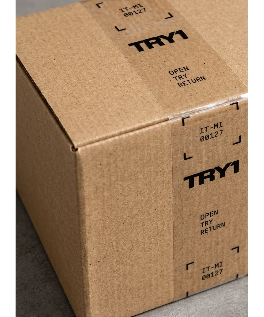
Packaging tape
Logo, unit ID and short functional messages repeat along the tape: OPEN · TRY · RETURN.
Business cards
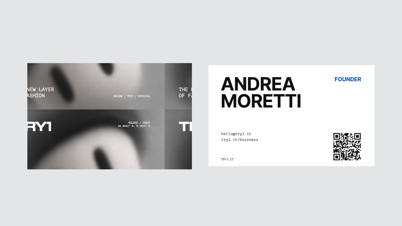
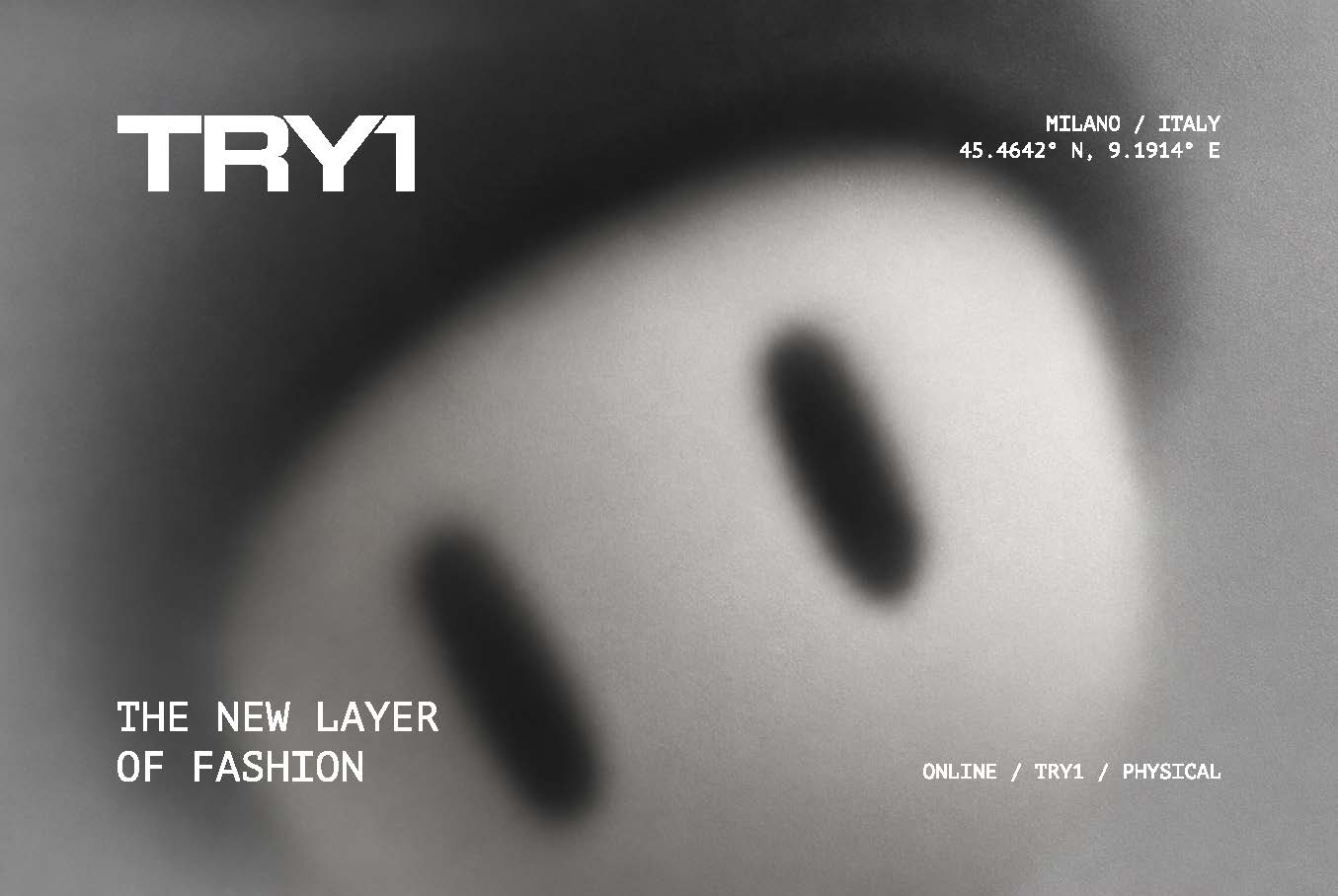
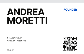
Front: the mascot face out of focus, with the wordmark and coordinates. Back: name, role, contacts and a QR code to try1.it.
A character to carry.
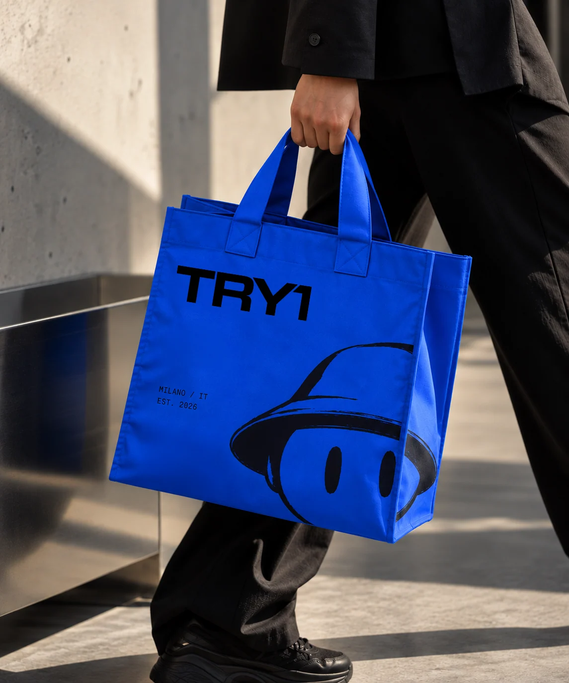
Merch is where the identity plays: oversized type, mascot illustrations and freer interpretations of the name on limited editions, while the official logo stays unchanged.
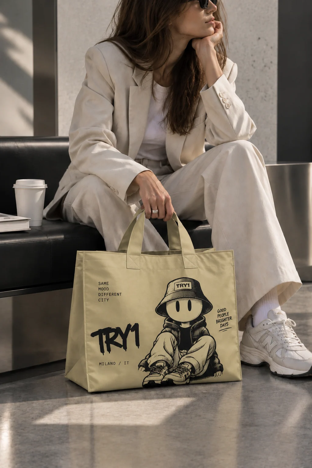
Creative totes
Mascot illustrations, expressive TRY1 lettering and campaign messages.
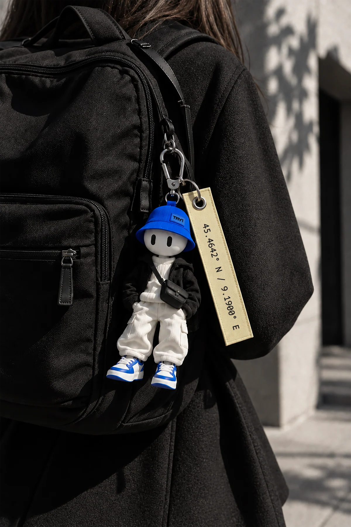
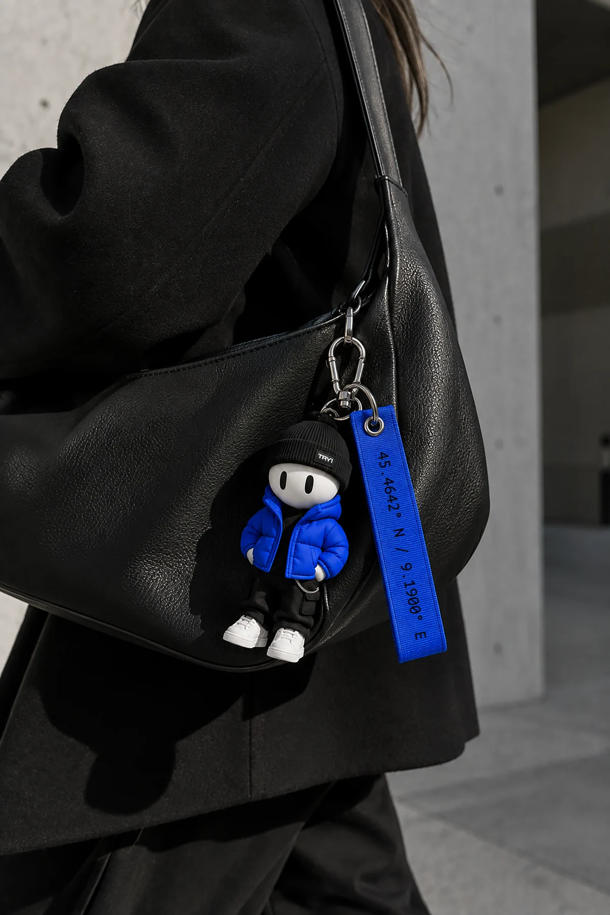
Mascot keychains
The character as a collectible object: tags, colour accents and location details.
A character with
a social life.
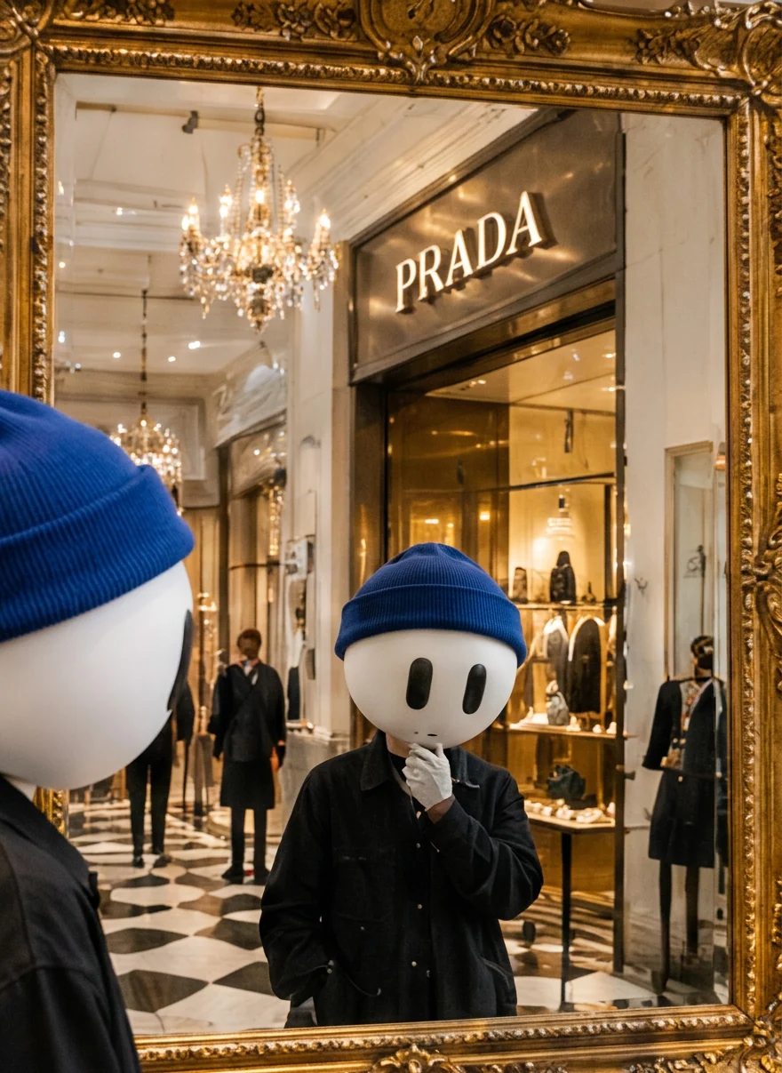
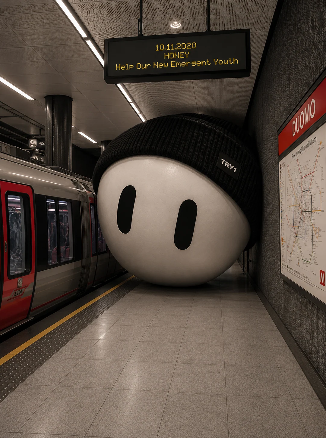
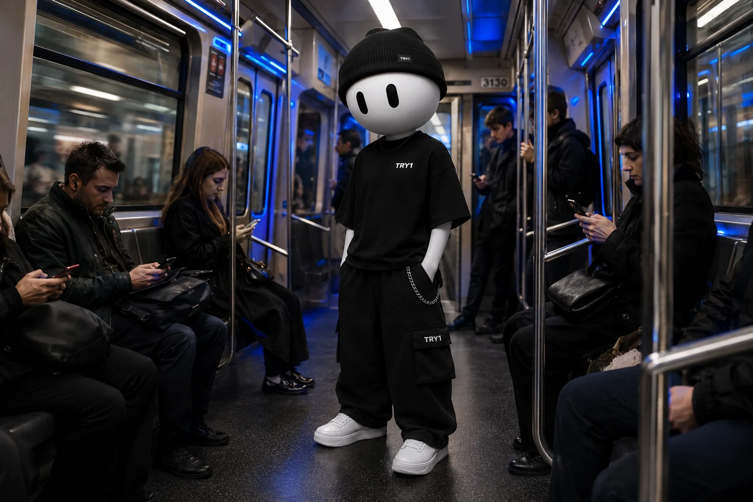
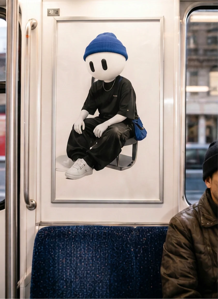
On social, the mascot lives in Milan: it rides the metro, visits partner stores, floats in a pool. Spontaneous and slightly playful, closer to street photography than to campaign imagery.
The city is our canvas.
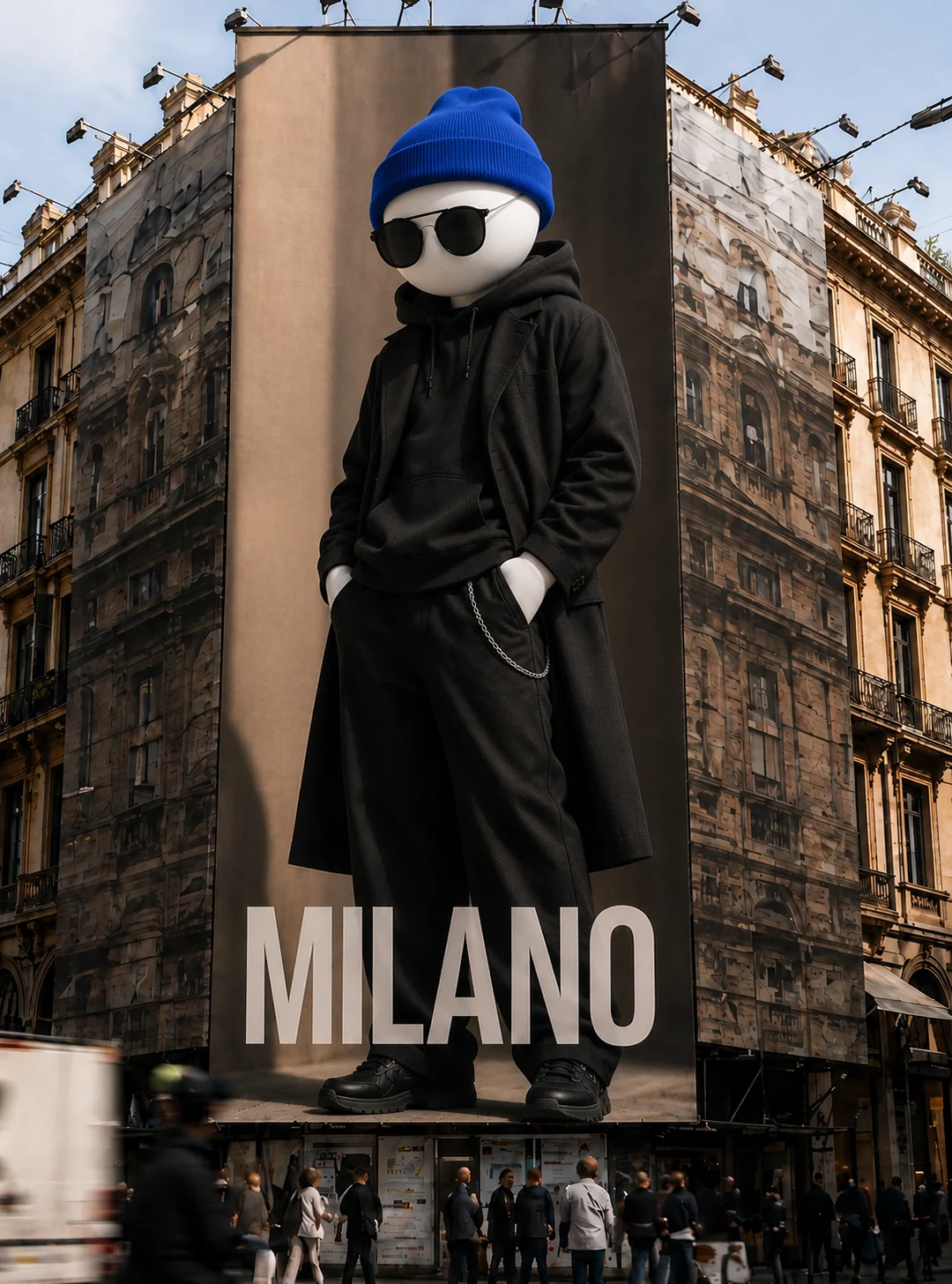
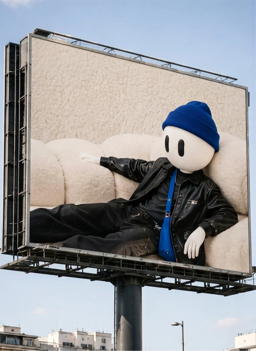
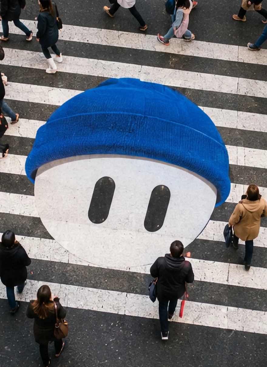
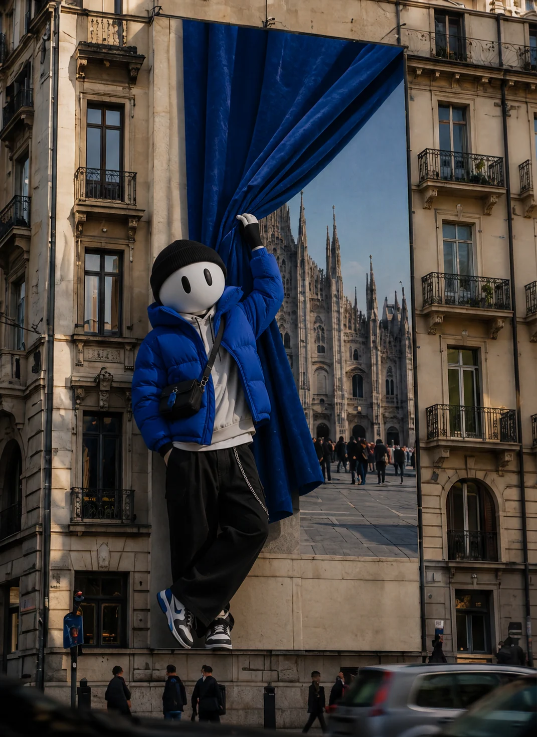
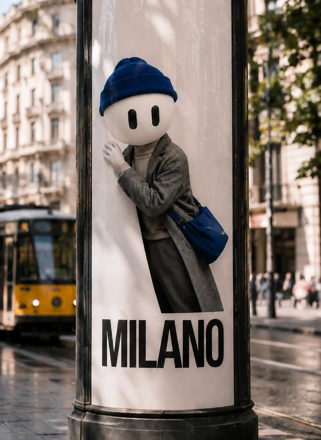
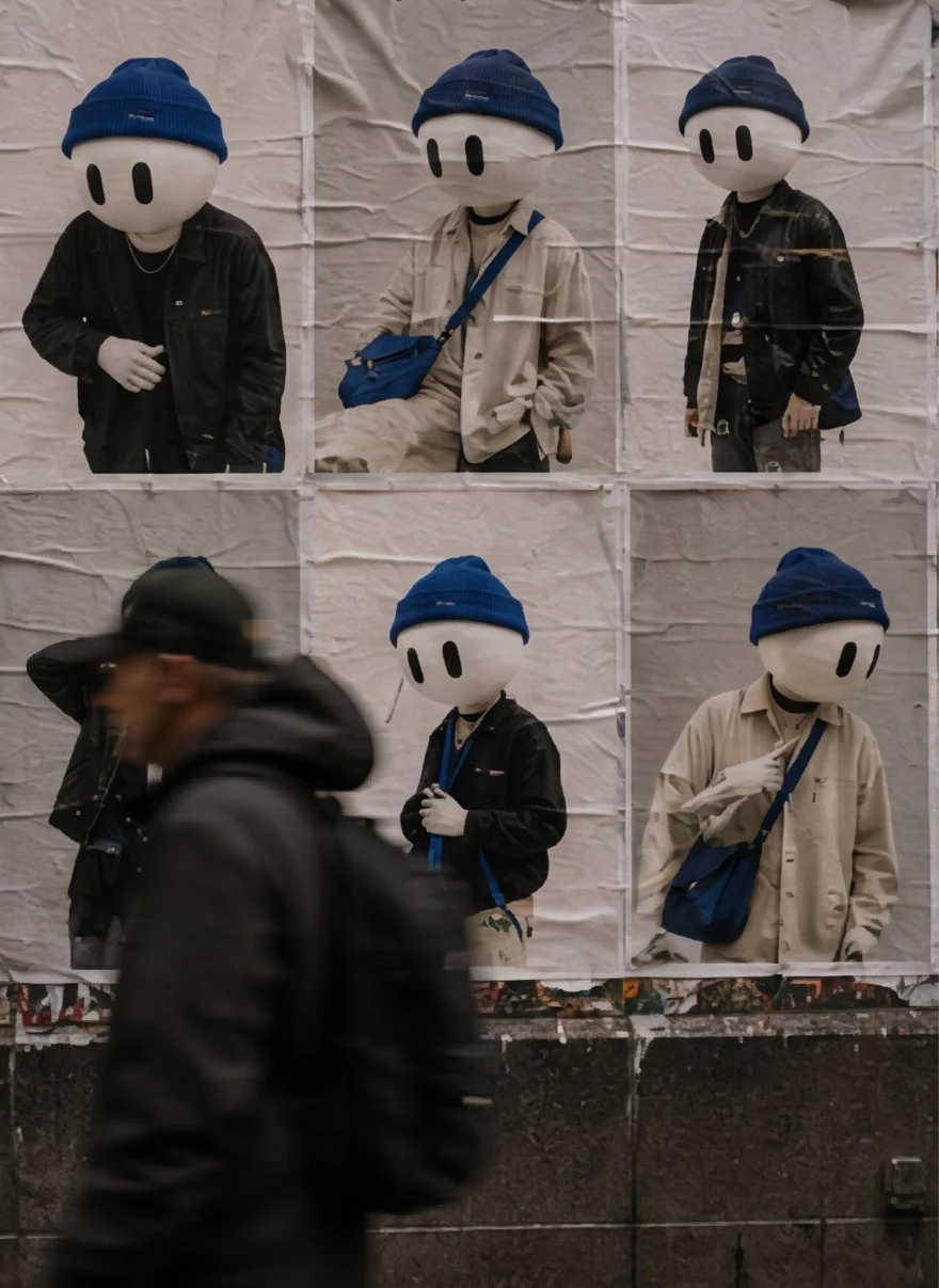
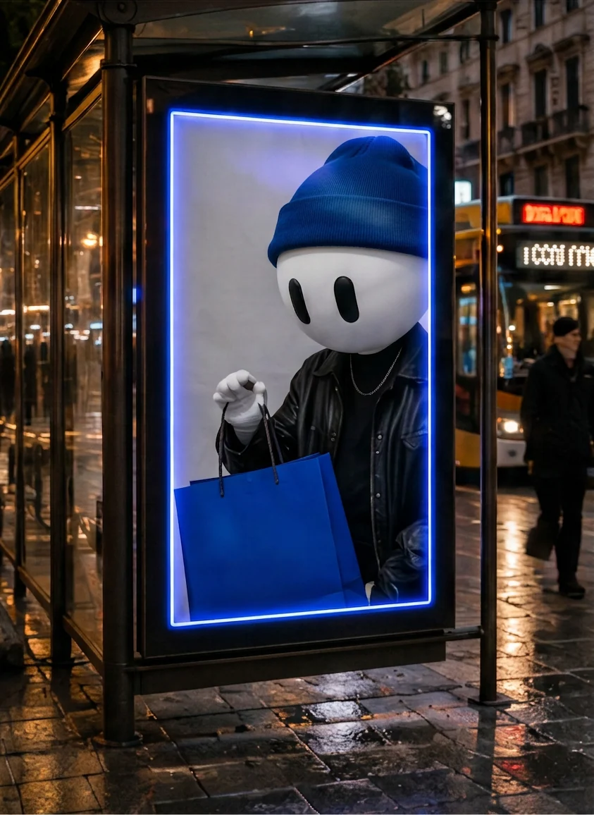
Outside conventional formats: bus shelters, crossings, building wraps and billboards around fashion locations. One character, one blue accent, a familiar city context, made to be photographed and shared.
Digital out-of-home
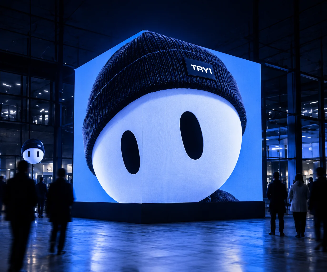
An anamorphic screen where the head breaks out of the frame.
Beyond the expected.
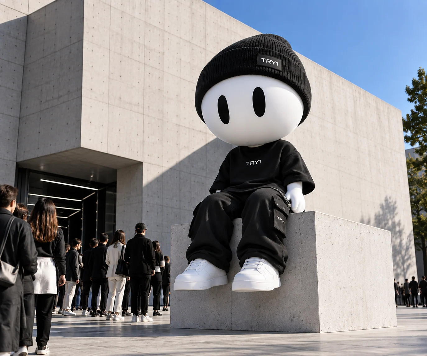
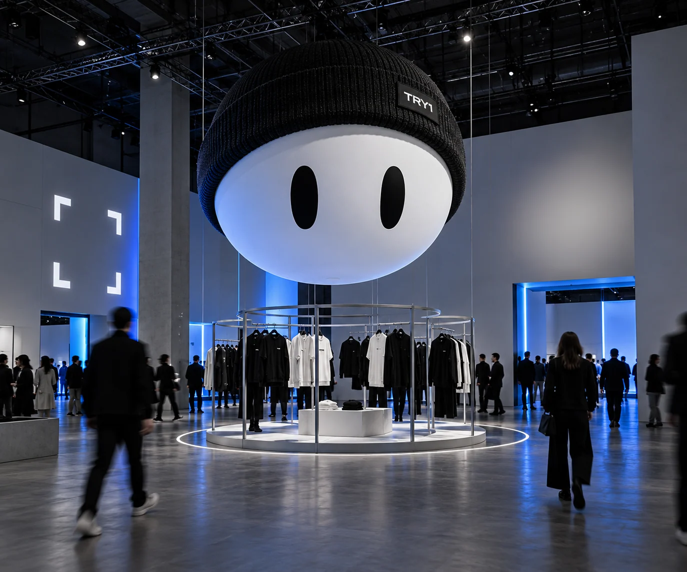
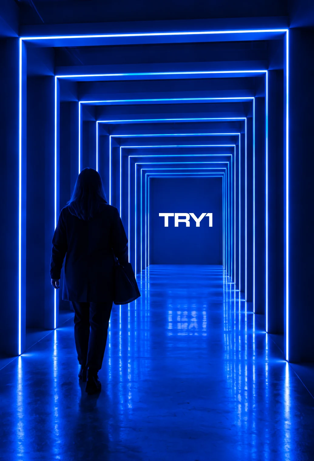
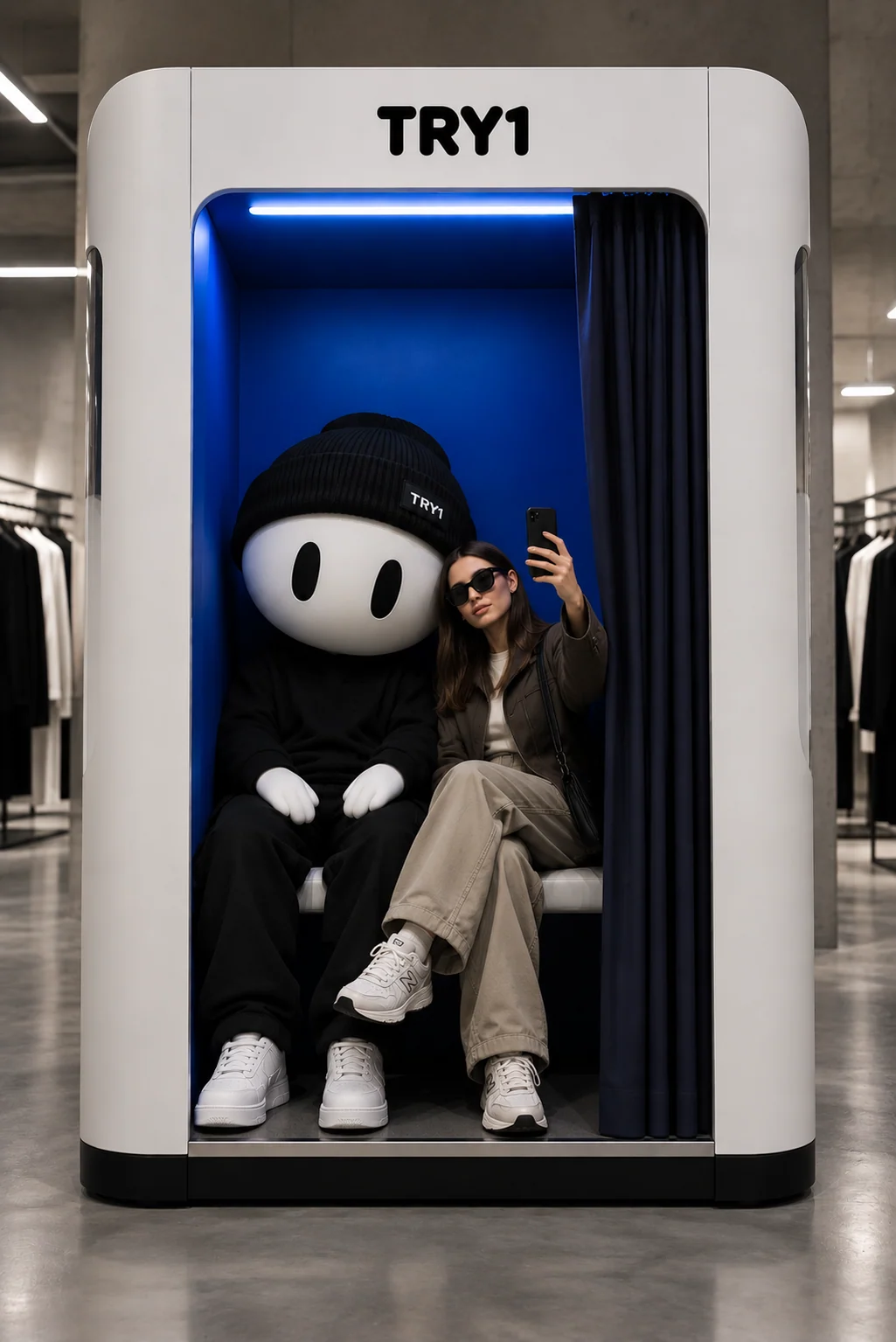
Brand moments people can step into: a mascot pavilion during fashion week, an oversized figure in the city, a TRY1 Blue light tunnel and a mascot photo booth.
Anna Dmitrieva
Creative direction, brand strategy and identity
Live website: try1.it ↗
Website designed and built by the TRY1 team