
ACTEAVE
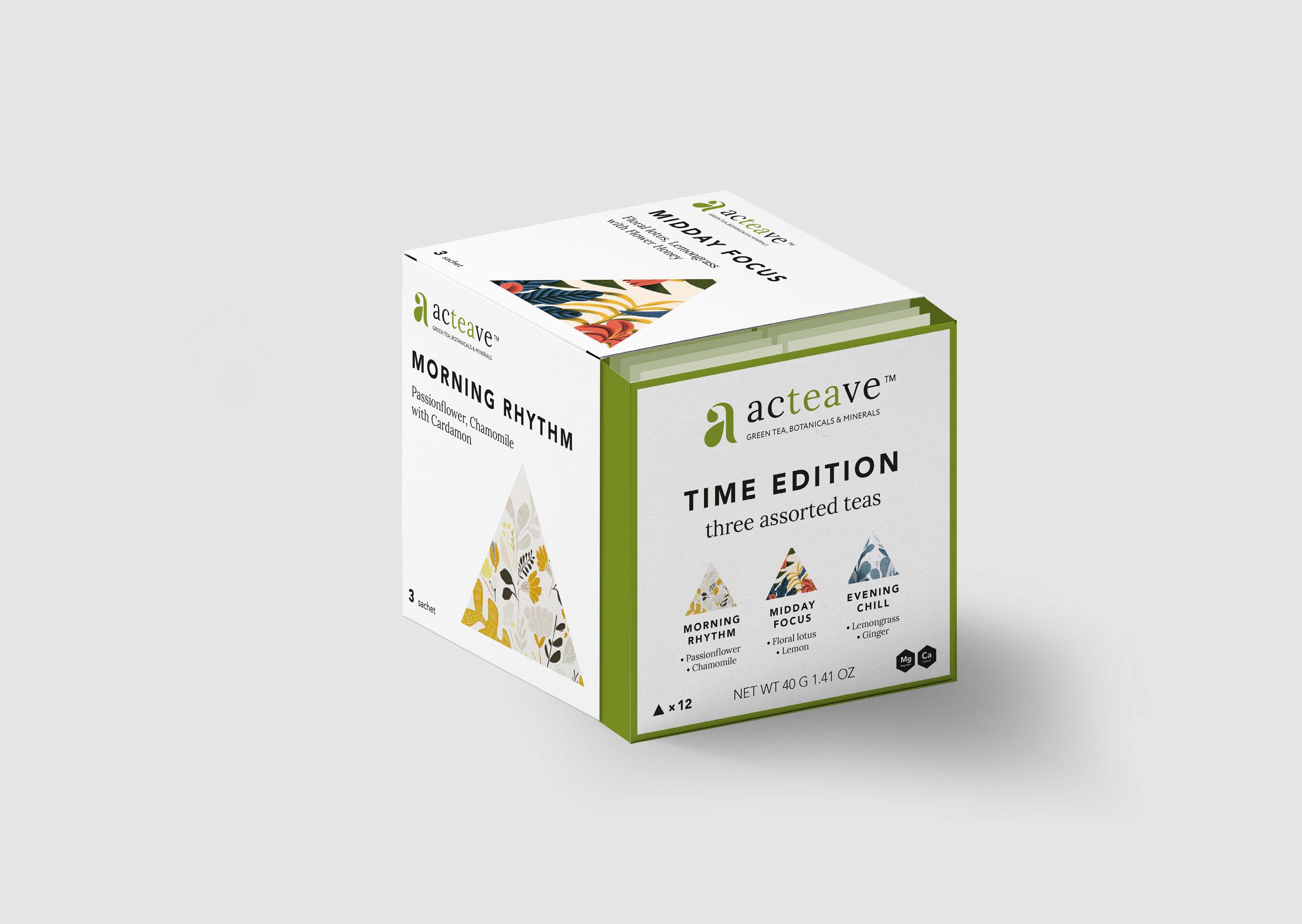
Brand identity and packaging for a green tea brand concept for the US market. Four moments of the day, four flavors and one visual system.
Brand identity & packaging — Anna Dmitrieva & Anastasia Ashukina
2022
A tea brand that follows
the rhythm of the day.
Green tea shelves look alike: the same greens, the same leaves, the same promises. Acteave needed to be recognizable at a glance and easy to navigate between flavors.
- Team
- Anna Dmitrieva
Anastasia Ashukina - Scope
- Brand identity, logo,
packaging system - Market
- United States
- Year
- 2022
From challenge
to solution.
Challenge
Make a green tea brand stand out on a crowded US shelf and keep several flavors easy to tell apart.
Idea
Name the flavors after moments of the day — Morning Rhythm, Midday Focus, Afternoon Boost, Evening Chill. Choosing a tea becomes choosing a mood.
Solution
A calm white base, a fluid serif wordmark and a triangle window with its own botanical illustration for every flavor.
Every moment
has its own flavor.
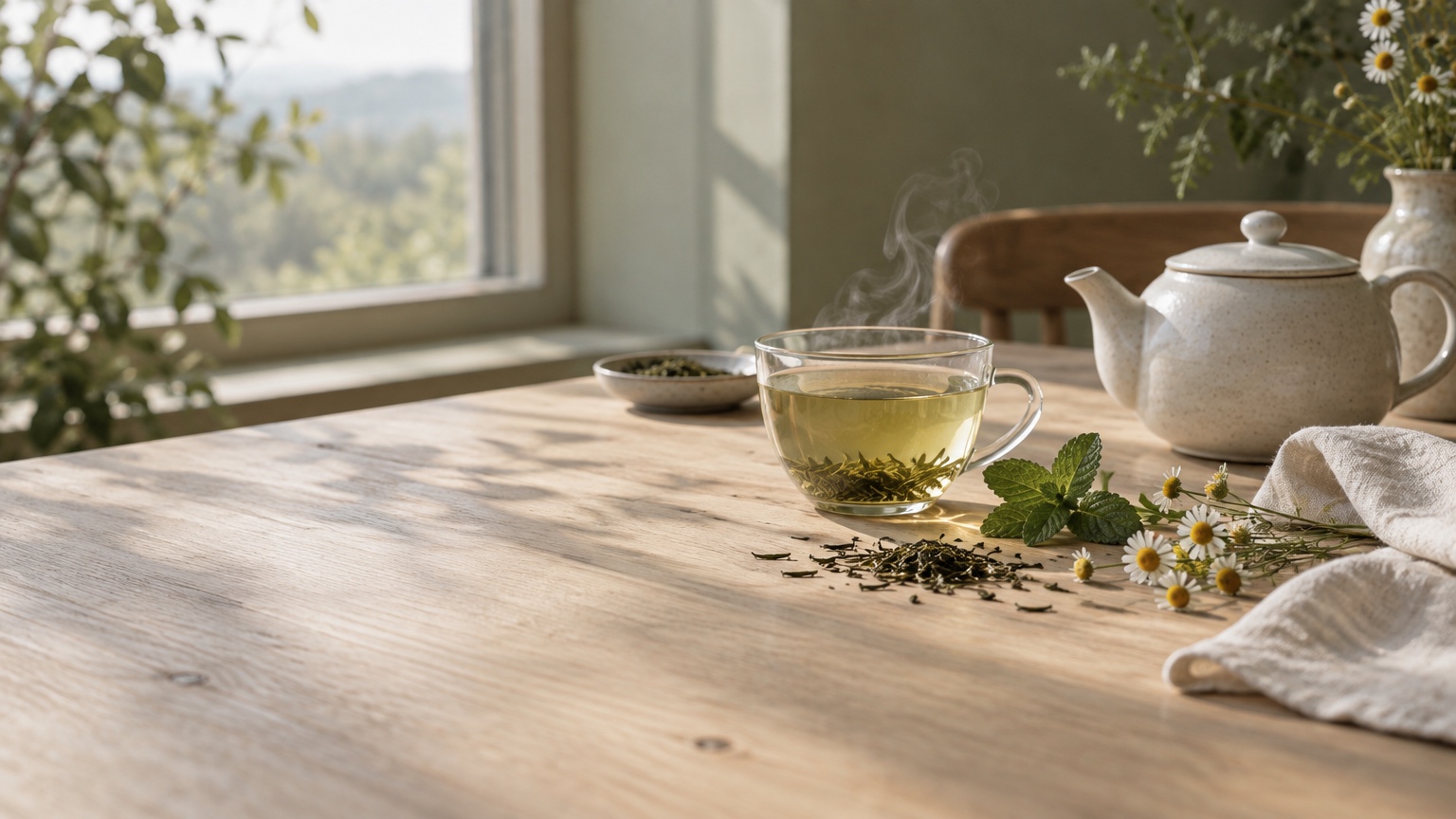
From morning rituals to evening pauses. Names, illustrations and accents help people choose a tea for their mood and time of day.
Character
in a single letter.
A fluid symbol and elegant serif lettering give the brand a soft, natural character. An olive accent ties them into one signature.

Olive
#7D8D27
Forest
#20271E
Cream
#F4F1E8
Midday
#E5CB63
Afternoon
#D27842
Evening
#315461
A small shape.
A world within.
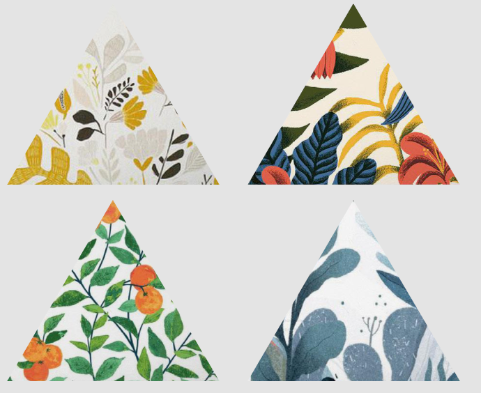
The triangle opens a window into the character of each tea. Botanical illustrations live inside it, while the white layout around it stays calm and consistent.
Four moments.
One visual language.
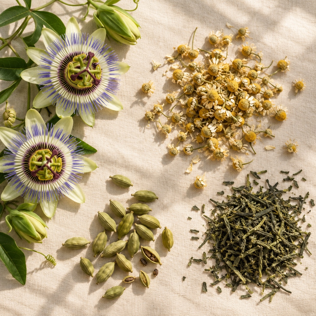
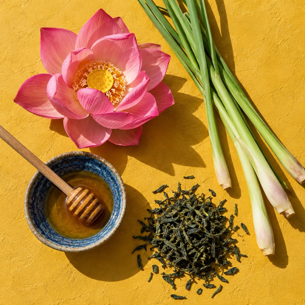
Each illustration is inspired by the real ingredients of the blend. The white layout keeps the four packs reading as one family on the shelf.
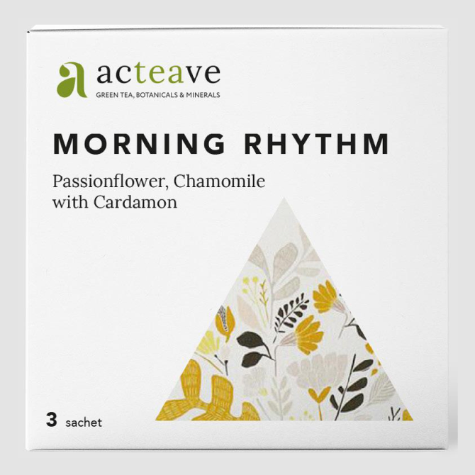
Morning Rhythm
A gentle start. Passionflower, Chamomile with Cardamom.
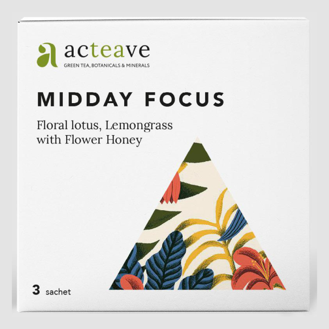
Midday Focus
Find your rhythm. Floral Lotus, Lemongrass with Flower Honey.
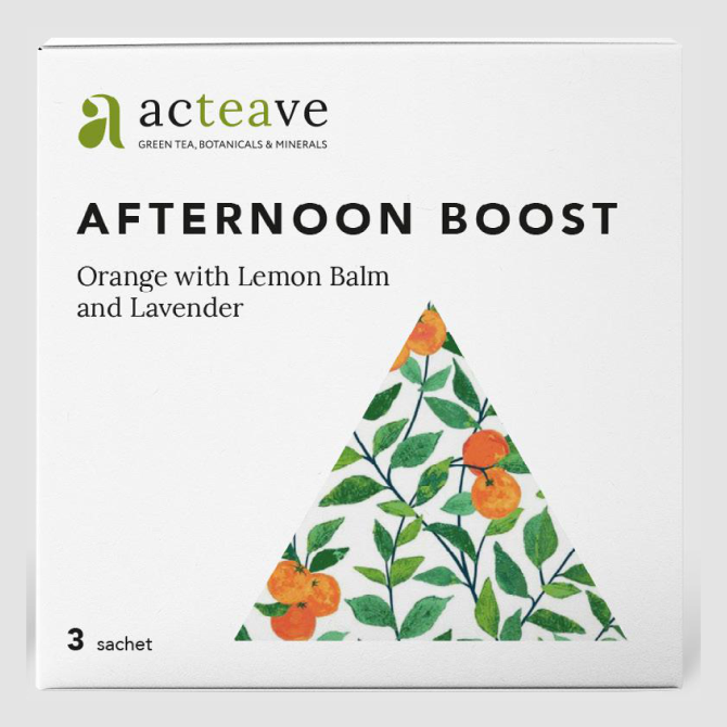
Afternoon Boost
An afternoon lift. Orange with Lemon Balm and Lavender.

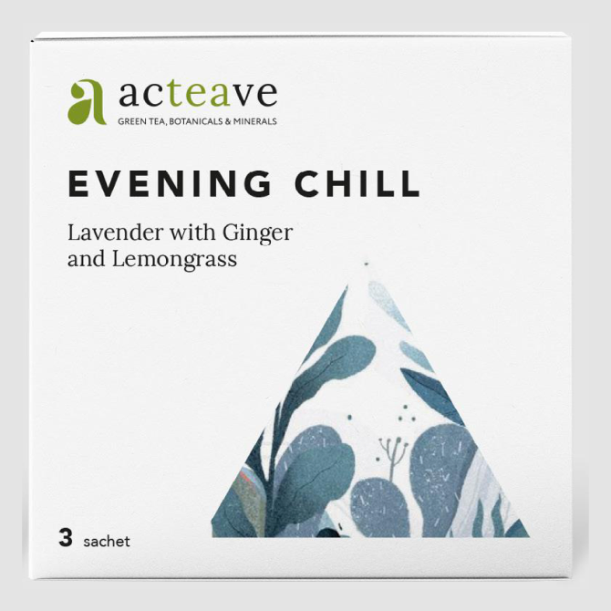
Evening Chill
Time to unwind. Lavender with Ginger and Lemongrass.

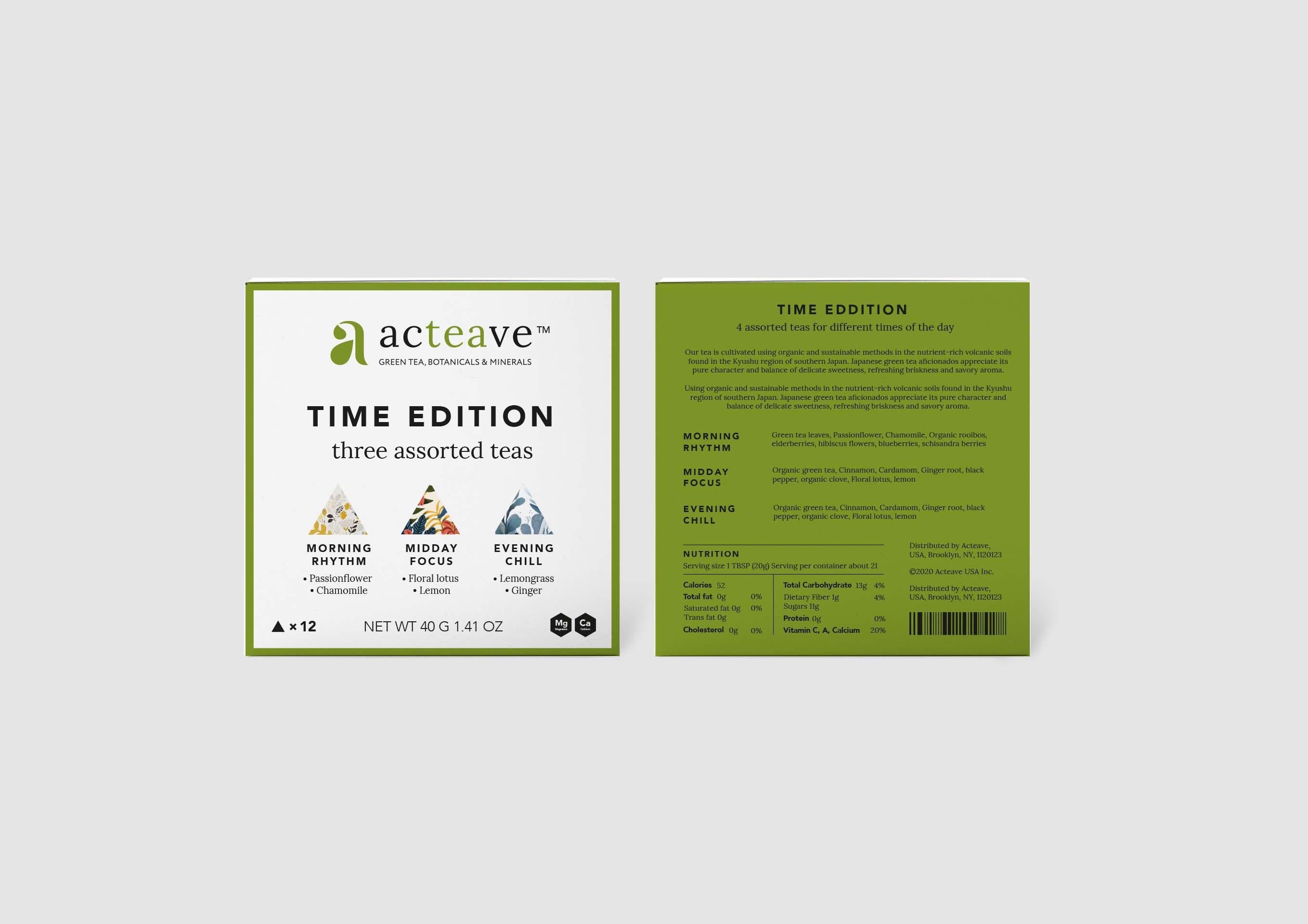
One collection.
All day.
Time Edition brings three teas into one assortment. The olive frame and a consistent hierarchy connect the front and back of the packaging.
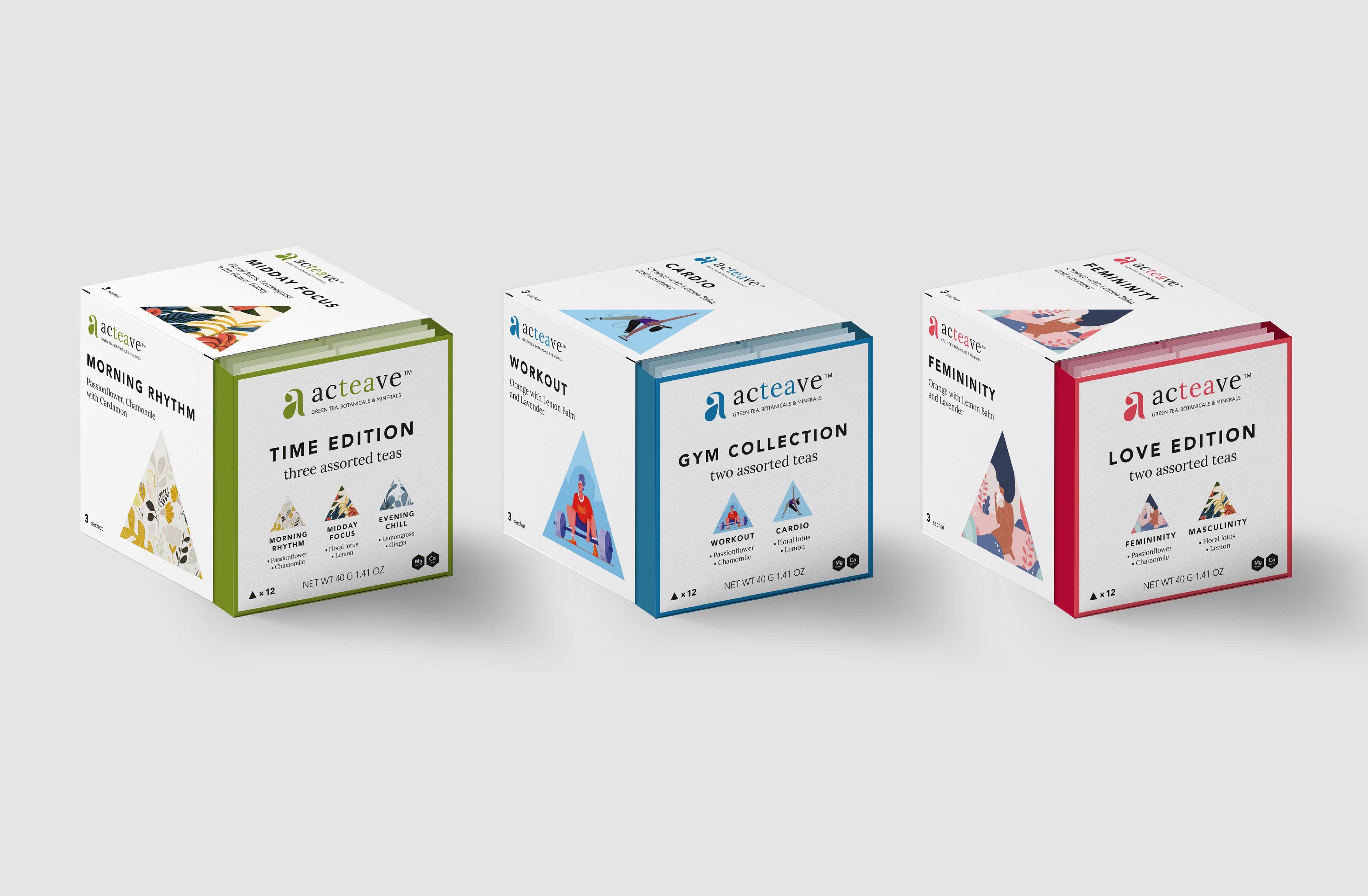
One brand.
Different moods.
Time Edition, Gym Collection and Love Edition extend the same system through different themes, illustrations and accent colors.
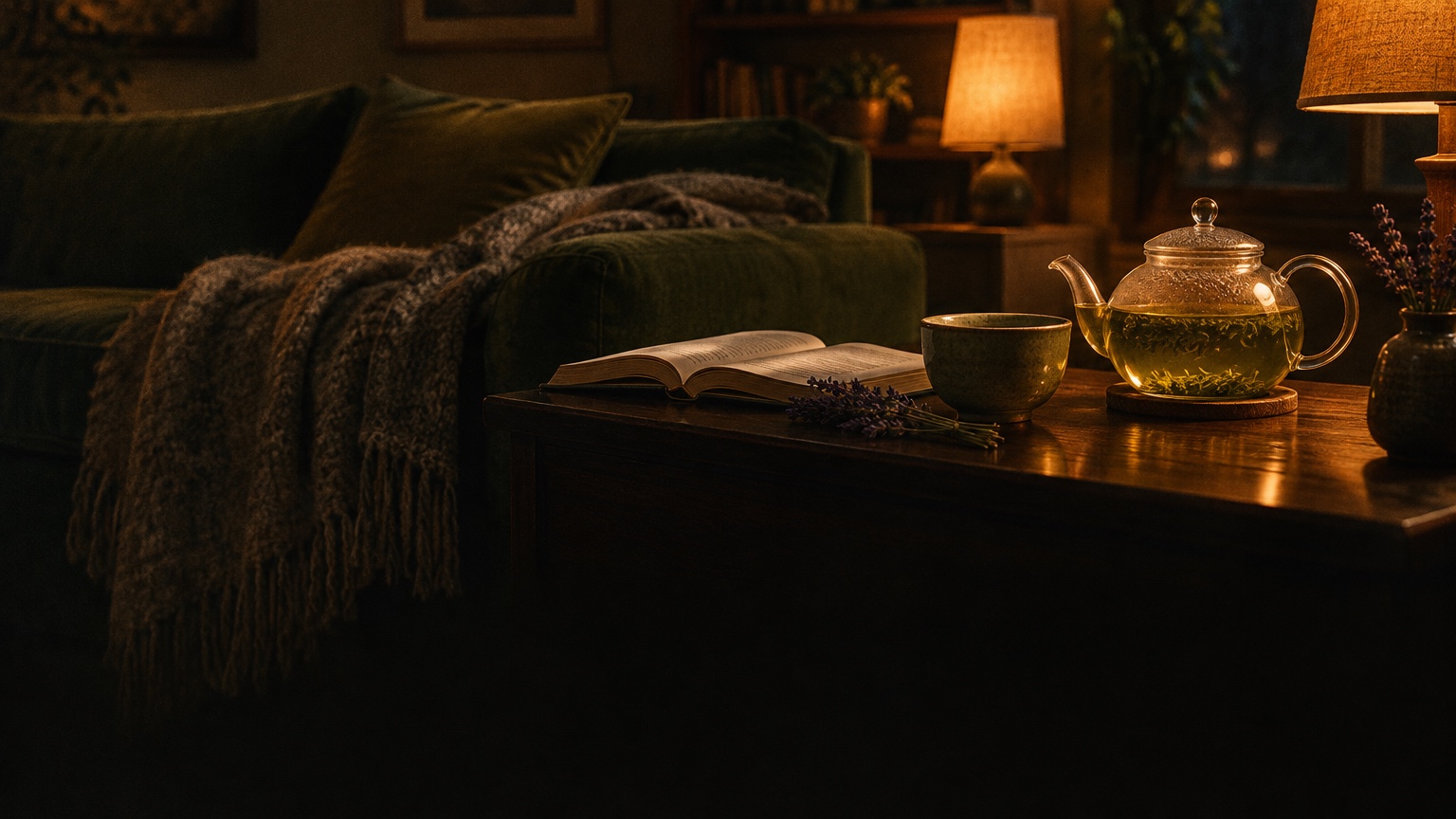
Tea for the way
you live.
A brand meant for everyday rituals — from the first cup in the morning to a quiet pause in the evening.
Anna Dmitrieva & Anastasia Ashukina
Brand identity & packaging
Brand identity · Logo · Packaging design
2022